
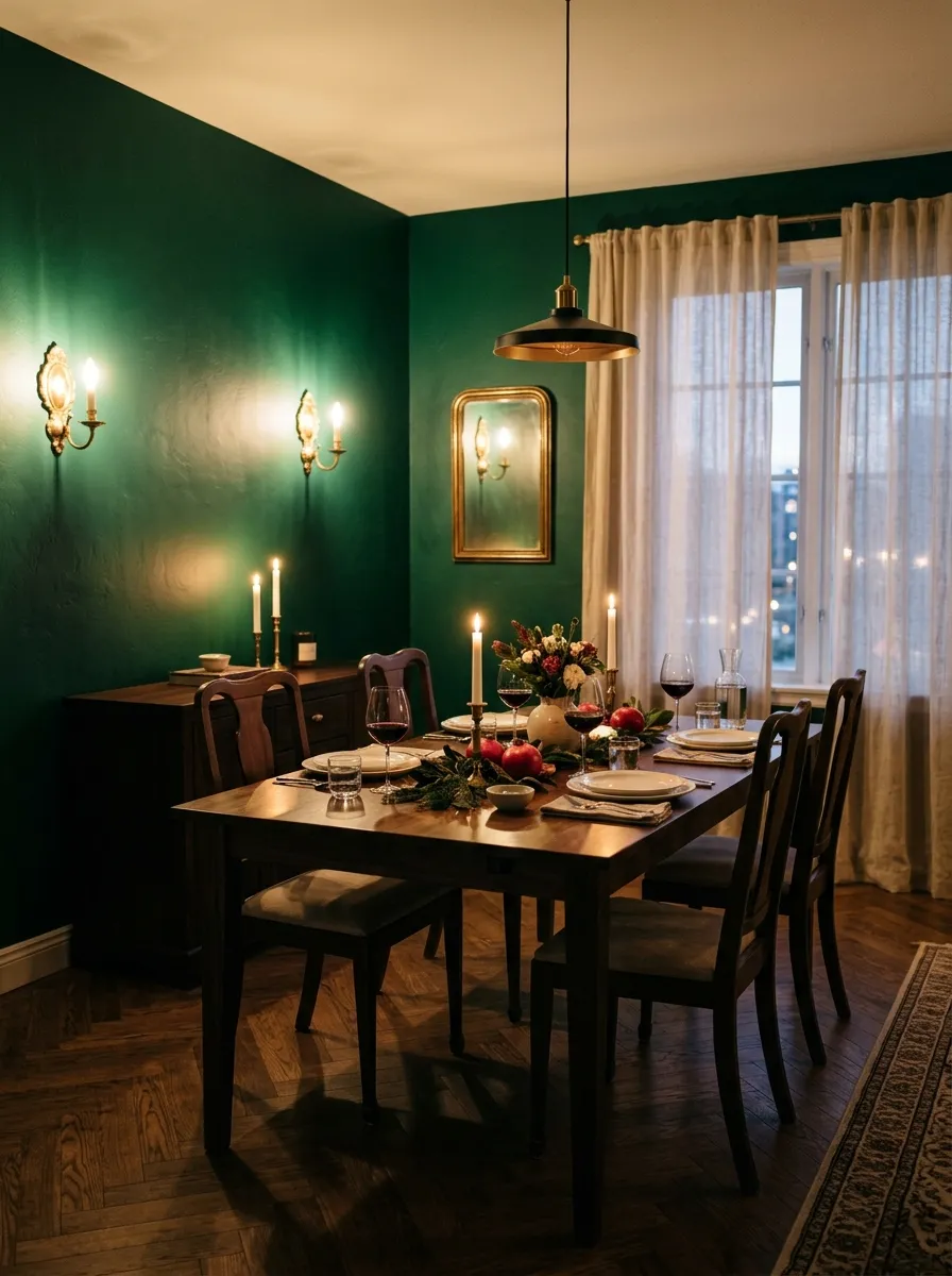
Moody Dining Room Ideas: Elegant Eclectic Inspiration for Every Home
Introduction
Picture walking into a dining room that feels like a warm hug wrapped in velvet and candlelight. That’s the magic of moody dining room ideas — spaces that trade bright and airy for rich, layered, and unforgettable. If you’ve ever scrolled past a dining room online and thought “I want to eat dinner there,” chances are it leaned moody. In my experience, these rooms photograph beautifully and feel even better in person. This guide walks through 25 ways to bring elegant, eclectic depth into your own dining space, whether you’re starting from scratch or updating what you already have.
Emerald Wall Depth
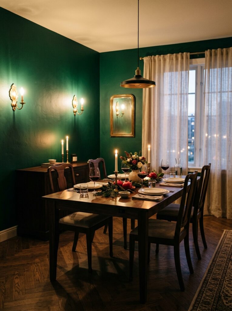
- Instantly adds richness without feeling heavy or dark
- Pairs beautifully with warm wood tones and brass fixtures
- Works in small rooms just as well as large ones
- Creates a backdrop that makes artwork and mirrors pop
Deep color on the walls is one of the fastest ways to transform a flat, forgettable dining room into something guests remember. Emerald in particular carries a jewel-toned richness that feels expensive without requiring a full renovation. A single coat of deep green paired with warm brass hardware creates contrast that photographs beautifully and feels grounded in person. I’ve noticed that rooms painted this way tend to feel more intimate during dinner parties, almost like the walls themselves are part of the hosting experience.
The best part about this approach is how forgiving it is. Unlike stark white walls that show every scuff and shadow, deep emerald hides imperfections while still reflecting candlelight in a warm, flattering way. It works whether your furniture is antique or modern, formal or relaxed. Many homeowners hesitate to commit to bold wall color, but a dining room is one of the safest places to experiment since it’s used for shorter periods and set the mood rather than daily function.
Also read: 25 Cozy Kitchen Ideas
Black Chandelier Statement
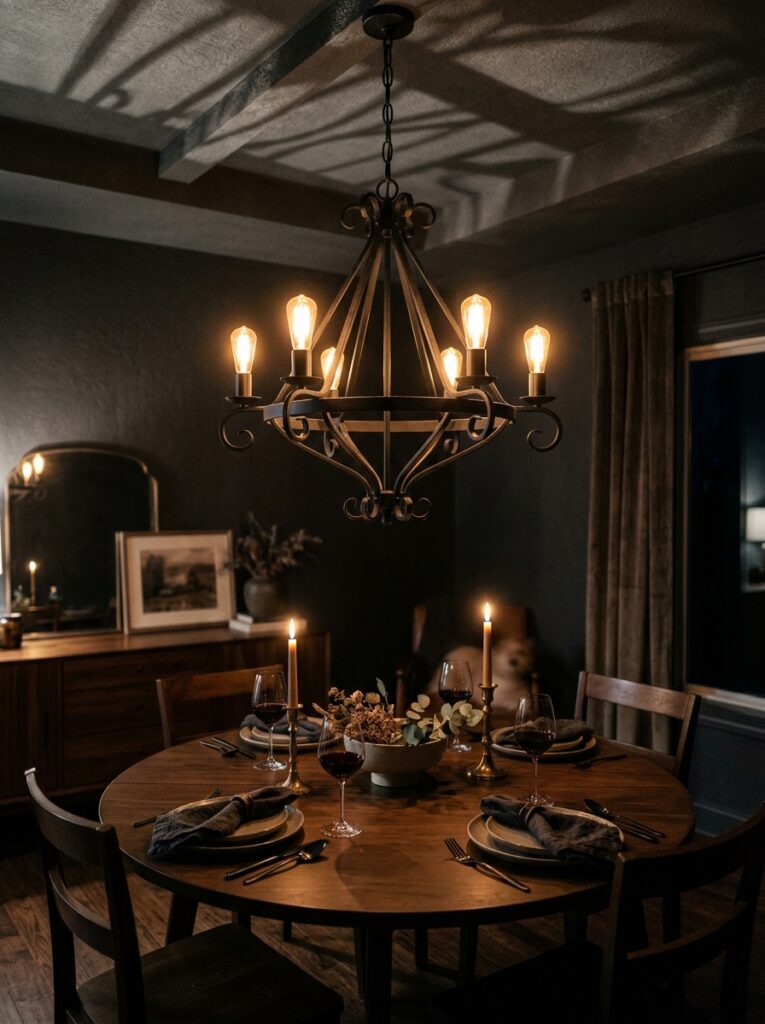
- Draws the eye upward and anchors the whole room
- Matte black finishes feel timeless rather than trendy
- Contrasts beautifully against lighter tablescapes
- Instantly upgrades a builder-grade light fixture
A chandelier does more heavy lifting in a dining room than almost any other single piece. Choosing a black or oil-rubbed bronze fixture instead of a bright brass or crystal option shifts the entire mood of the space toward something more grounded and sophisticated. It becomes the visual anchor that everything else in the room responds to, from the table setting below to the artwork on the walls. That’s why many designers recommend starting a dining room redesign with lighting rather than paint.
Beyond aesthetics, a darker fixture tends to hide dust and wear better than polished metals, which is a practical bonus for a room that collects candle drips and cooking steam. Pairing it with warm-toned bulbs rather than cool white light keeps the glow flattering for both food and faces. Even a modest budget chandelier swap can shift a dining room from forgettable to the most photographed corner of the house.
Velvet Chair Upholstery
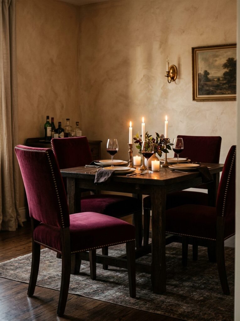
- Adds instant softness and tactile richness to the room
- Deep colors like burgundy or navy age well over time
- Nailhead trim gives an elegant, tailored finish
- Comfortable seating encourages guests to linger longer
Velvet has a way of making a room feel finished the moment it’s added. Swapping plain wooden or fabric dining chairs for velvet-upholstered ones in a deep jewel tone instantly raises the perceived value of the entire space. The fabric catches candlelight differently than cotton or linen, creating subtle highlights that shift as people move around the table. I’ve seen this work well in even the most budget-conscious makeovers, where reupholstering just the seat cushions made a dramatic difference.
Beyond looks, velvet dining chairs tend to feel more inviting, which matters for a room meant to host long conversations over dinner. Choosing a color like burgundy, forest green, or deep navy ensures the chairs won’t clash with an evolving color scheme down the road. Adding brass or nailhead trim along the edges gives a tailored, custom-furniture look even on ready-made pieces from a standard retailer.
Antique Brass Accents
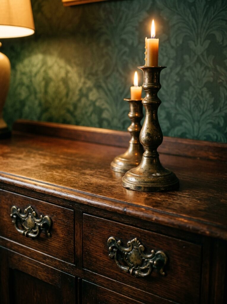
- Warms up cooler color palettes like charcoal or navy
- Aged patina feels collected rather than newly bought
- Works on hardware, lighting, and small decor pieces alike
- Ties eclectic elements together with a consistent metal tone
Brass has a way of softening even the darkest color schemes. Where chrome or nickel can feel cold against deep green or black walls, antique brass brings warmth back into the room. It shows up beautifully on drawer pulls, picture frame edges, candlestick holders, and even chair legs. In my experience, choosing one consistent metal finish throughout a room — rather than mixing brass, chrome, and black indiscriminately — is what makes an eclectic space feel intentional instead of cluttered.
The aged, slightly imperfect look of antique brass also tends to age gracefully with actual use, unlike shinier finishes that show fingerprints and water spots quickly. Thrifted or vintage brass pieces bring authenticity that new mass-produced hardware can’t replicate, and they’re often more affordable too. A few well-placed brass accents can visually connect a dark table, a patterned rug, and a bold wall color that might otherwise feel disconnected from one another.
Layered Gallery Wall
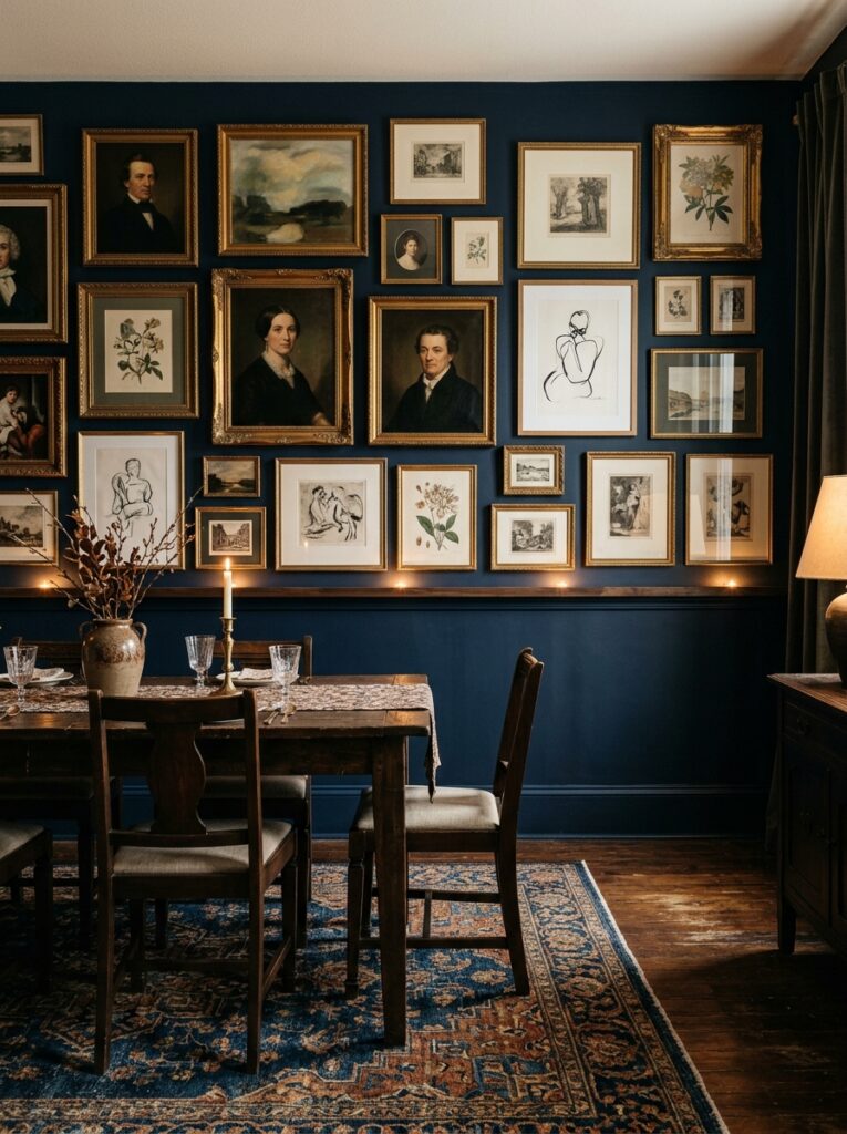
- Fills large blank walls with personality and texture
- Mixing frame styles keeps the eclectic feel authentic
- Works with existing art rather than requiring new purchases
- Adds depth and storytelling to an otherwise plain room
A gallery wall is one of the most effective ways to bring an eclectic sensibility into a moody dining room without touching the furniture at all. Grouping framed pieces of varying sizes, frame finishes, and subject matter against a dark wall creates a layered, collected-over-time look that feels far more personal than a single oversized print. It’s an especially good solution for awkward blank walls above a buffet or sideboard that otherwise go unused.
The key to making this work is resisting the urge to match everything perfectly. A few gold frames next to dark wood ones, a small mirror mixed among prints, and varying artwork sizes all contribute to that elegant eclectic feeling rather than a showroom-perfect symmetry. I’ve noticed that gallery walls also make a room feel more finished in photographs, giving Pinterest browsers a reason to save the image for their own inspiration boards.
Dark Wood Table Anchor
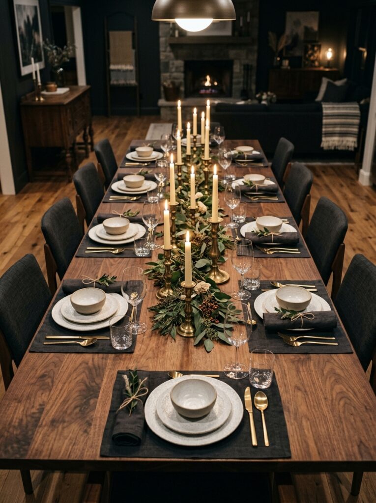
- Grounds the whole room with warmth and natural texture
- Dark stains hide scratches better than light wood finishes
- Pairs well with both modern and vintage chair styles
- Creates strong contrast against lighter tableware and linens
The dining table itself sets the tone for everything built around it. Choosing a dark walnut, mahogany, or ebonized wood finish over a lighter oak or pine gives the room an immediate sense of gravity and permanence. Dark wood also does double duty practically, since it hides water rings, scuffs, and the general wear that comes with daily family meals far better than pale finishes do. This is why many designers recommend starting a moody redesign with the table before anything else in the room.
A dark table also acts as a neutral base that welcomes color and pattern everywhere else — patterned rugs, colorful chairs, bold wallpaper, or layered linens all sit comfortably against it. Vintage or reclaimed wood tables bring even more character thanks to their existing patina and imperfections, which fit naturally into an eclectic design approach. Even a budget table can be transformed with a dark stain and a weekend of sanding.
Layered Table Linens
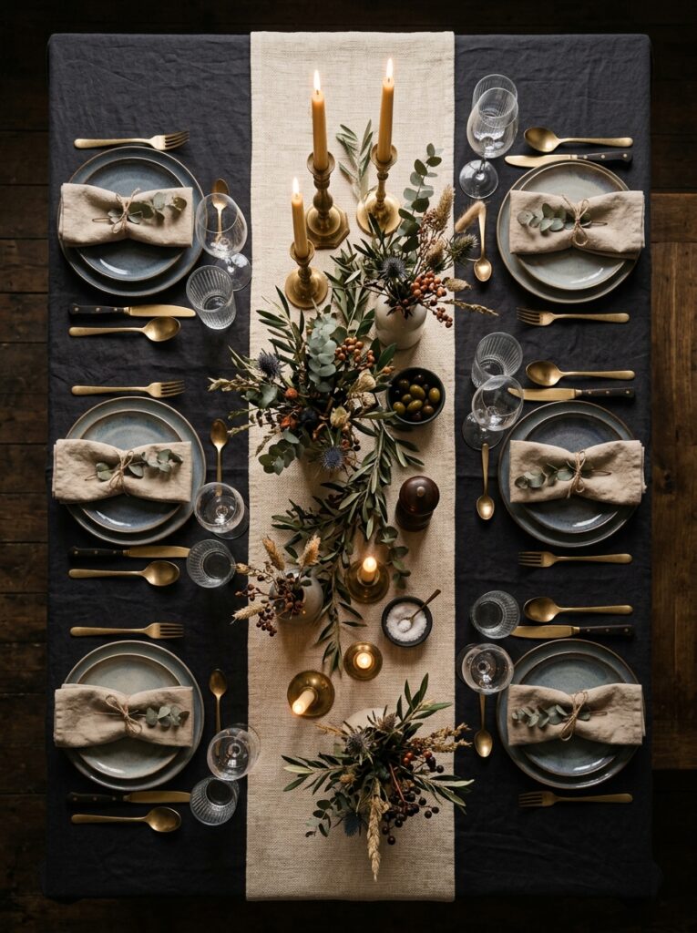
- Adds dimension to the table without needing new furniture
- Mixing textures like linen and cotton feels collected, not matchy
- Easy and affordable to swap seasonally or for events
- Creates a soft base that makes tableware stand out
Table styling is often overlooked in favor of bigger furniture decisions, but linens are one of the fastest ways to shift a dining room’s entire mood. Layering a darker base cloth with a contrasting runner or placemats on top creates visual depth that a single flat tablecloth simply can’t achieve. Choosing muted, moody tones like deep rust, charcoal, or forest green over crisp white keeps the elegant eclectic feel consistent from the walls down to the table itself.
This approach is also one of the most budget-friendly updates on this entire list, since fabric is inexpensive compared to furniture or lighting. I’ve tried layering vintage linens picked up secondhand with newer neutral pieces, and the mix always reads as more curated than anything bought as a matching set. Rotating linens seasonally also means the same table and chairs can feel entirely different for a holiday dinner versus a quiet weeknight meal.
Candlelight Centerpieces

- Instantly warms up a room more than overhead lighting alone
- Varying candle heights add visual interest to the tablescape
- Works for both everyday dinners and special occasions
- Inexpensive way to elevate the mood of any meal
Nothing shifts a dining room’s atmosphere as instantly as candlelight. Overhead fixtures illuminate a space evenly, but candles create flickering pools of warm light that make food, faces, and finishes all look more flattering. Arranging candlesticks of varying heights down the center of the table, rather than a single centerpiece, adds a rhythm to the tablescape that feels intentional and elegant rather than an afterthought.
In my experience, this is the single easiest change anyone can make to a dining room’s mood without spending much money at all. A handful of taper candles in mismatched brass holders, mixed with a few dried floral stems or greenery, brings the eclectic, collected feeling this style is known for. Dimming or even turning off overhead lights during dinner and relying mostly on candlelight instantly makes a weeknight meal feel like an occasion worth savoring.
Jewel Tone Drapery
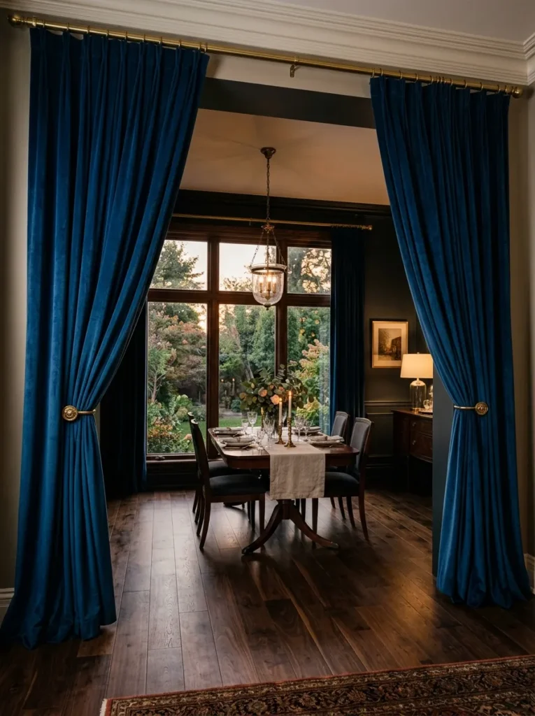
- Frames windows with rich color instead of plain neutrals
- Velvet or heavy fabric adds texture and sound dampening
- Deep jewel tones photograph beautifully in both day and evening light
- Softens hard architectural lines like window frames and trim
Curtains are an easy element to overlook, but jewel-toned drapery in sapphire, emerald, or plum instantly upgrades a dining room’s sense of luxury. Heavier fabrics like velvet also absorb sound, which makes dinner conversations feel more intimate rather than echoing off hard surfaces. Floor-length panels hung close to the ceiling rather than just above the window frame create the illusion of taller ceilings, which pairs especially well with darker wall colors that can otherwise feel closing-in if under-executed.
Choosing drapery in a color family that complements rather than exactly matches the walls keeps the eclectic sensibility intact. A deep blue curtain against emerald walls, for instance, adds contrast and layered richness rather than a monochromatic, flat look. Natural light filtering through richly colored fabric during the day creates a soft, warm glow that shifts beautifully into full moody drama once evening candles and lamps take over.
Vintage Mirror Statement
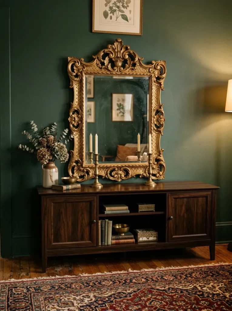
- Bounces warm light around a room that lacks big windows
- Ornate frames add old-world elegance without full renovations
- Makes small dining rooms feel more spacious visually
- Serves as a striking focal point above a buffet or console
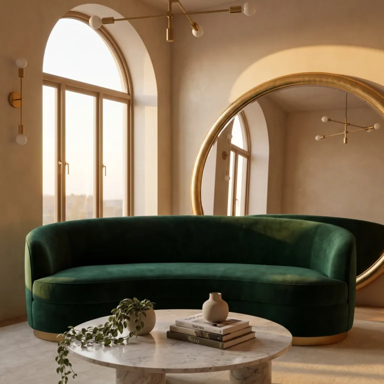
A large vintage mirror does more than reflect light — it acts as a piece of art in its own right. An ornately carved gold or aged wood frame brings old-world character into a room, especially when paired against deep, moody wall colors that would otherwise swallow smaller decor. Hanging one above a sideboard or buffet gives guests something to admire while also visually doubling the warm candlelight glow bouncing across the room during dinner.
Vintage and antique store finds work especially well here, since a mirror with some age and imperfection fits the eclectic aesthetic far more convincingly than something brand new and pristine. I’ve noticed that even a single oversized mirror can make a small or narrow dining room feel noticeably larger, simply by reflecting the window, chandelier, or artwork positioned across from it. It’s a one-item solution that solves both a decorating and a spatial challenge at once.
Botanical Wallpaper
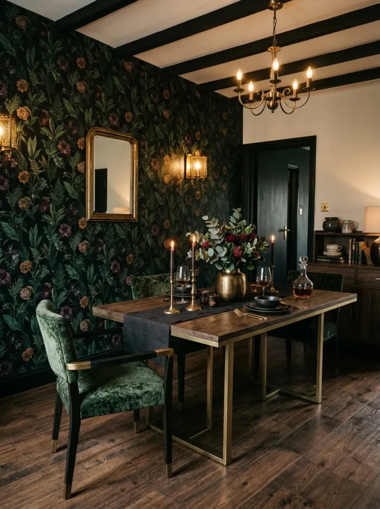
- Adds pattern and depth without needing multiple art pieces
- Dark backgrounds keep botanical prints from feeling too bright or busy
- Works especially well on a single accent wall
- Brings an organic, nature-inspired layer into a formal room
Wallpaper has made a strong comeback, and dark botanical prints in particular suit the elegant eclectic dining room aesthetic perfectly. Choosing a pattern with a black or deep charcoal background rather than white keeps the print from overwhelming the space, letting the greenery and floral details read as rich texture rather than busy pattern. This works especially well applied to just one accent wall, often the one behind a buffet or the head of the table, rather than the entire room.
This approach also gives an easy way to introduce nature-inspired elements into a room that otherwise leans formal and dark. I’ve seen this work particularly well in dining rooms with limited natural light, where deep botanical wallpaper actually enhances the cozy, enveloping mood rather than making the space feel darker in a negative sense. Pairing it with brass fixtures and warm bulbs keeps everything feeling intentional rather than overwhelming.
Mixed Metal Fixtures
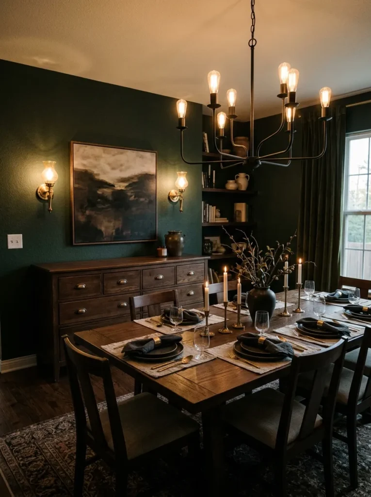
- Combining two or three metals adds depth without feeling mismatched
- Prevents the room from feeling like a matching furniture showroom
- Allows flexibility when adding vintage or thrifted pieces over time
- Ties together lighting, hardware, and decor cohesively
A common misconception in interior design is that every metal finish in a room needs to match exactly. In reality, thoughtfully mixing two or three metals — say, a black chandelier, brass candlesticks, and bronze drawer pulls — creates a far more layered and collected look than an all-matching set ever could. This approach is especially suited to the eclectic side of this style, since it allows pieces gathered over time from different sources to coexist naturally.
The trick is consistency in undertone rather than exact matching finish. Warm metals like brass, bronze, and aged gold tend to play well together, while a single cooler accent like matte black can be introduced for contrast without clashing. Many designers recommend choosing a dominant metal for large fixtures like chandeliers, then layering in one or two complementary metals through smaller accents like candlesticks, frames, or hardware.
Leather Upholstered Seating
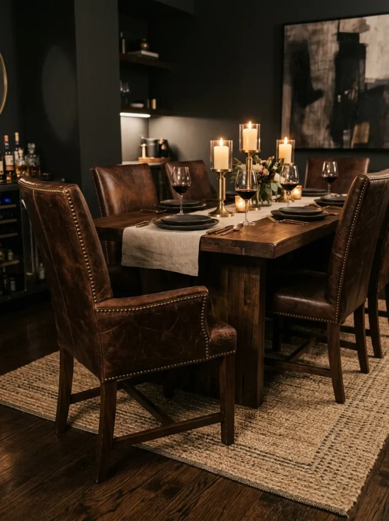
- Brings a more masculine, tailored edge to a moody palette
- Ages beautifully with visible character over time
- Easier to clean than fabric upholstery for everyday use
- Pairs naturally with dark wood and brass accents
Leather seating brings a different texture entirely into the moody dining room mix, offering a more tailored, masculine-leaning contrast to velvet or linen options. A rich cognac or espresso-toned leather chair develops a beautiful patina with use, actually improving in appearance the more it’s lived with rather than showing wear the way lighter fabrics do. This makes it a particularly practical choice for busy households with children or frequent guests.
Leather also cleans up easily after spilled wine or dropped food, a real consideration in any dining room used regularly rather than just for special occasions. I’ve seen this work well paired against deep charcoal or navy walls, where the leather’s warm brown tones soften what could otherwise feel like a cold, overly formal room. Mixing leather chairs at the heads of the table with upholstered or wood chairs along the sides adds an eclectic, collected variety to the seating arrangement.
Charcoal Ceiling Paint
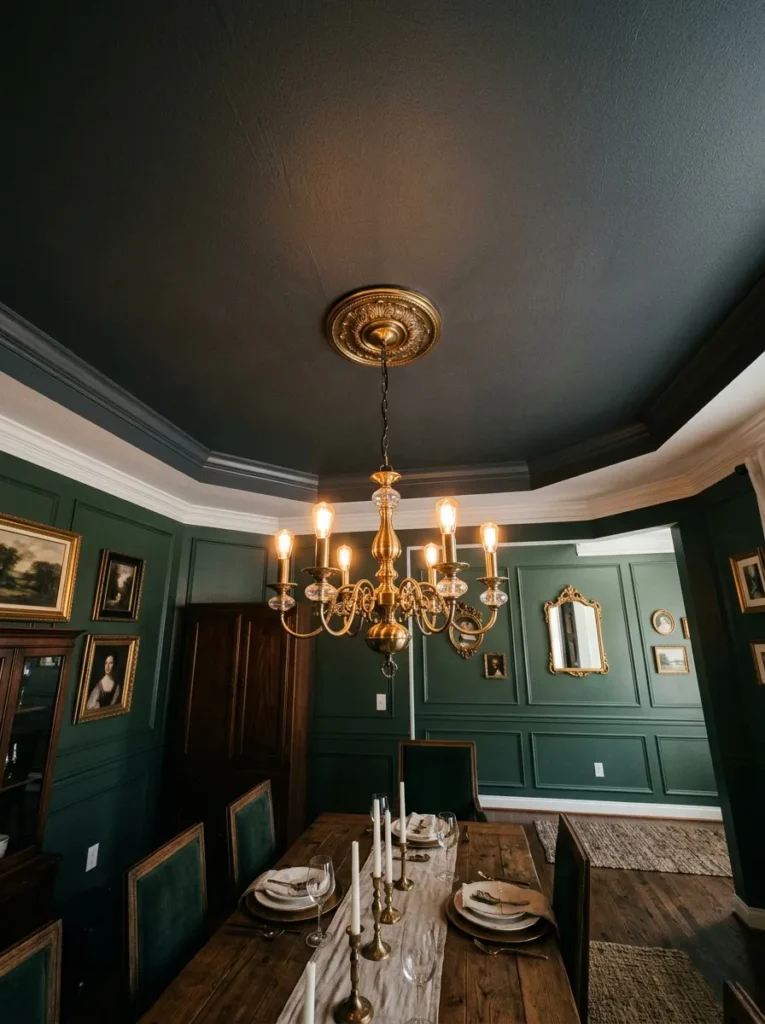
- Creates a cozy, enveloping “jewel box” effect overhead
- Balances rooms with high or awkward ceiling proportions
- Makes chandeliers and light fixtures stand out more dramatically
- Often overlooked but transforms a room’s entire feel
Painting the ceiling is one of the most underused tricks in dining room design, yet it might be the single most transformative one on this list. A charcoal or deep espresso-toned ceiling creates what designers often call a “jewel box” effect, wrapping the entire room in color rather than leaving a stark white gap overhead that breaks the immersive, cozy mood built everywhere else. It’s a particularly effective fix for rooms with awkwardly tall or oddly proportioned ceilings.
Against a dark ceiling, chandeliers and pendant lights become even more dramatic focal points, since there’s no bright white backdrop competing for attention. In my experience, homeowners are often hesitant to paint a ceiling anything other than white, but a dining room — a space used primarily in the evening under warm lighting — is one of the lowest-risk rooms in the house to experiment with this bold approach.
Ornate Rug Layering
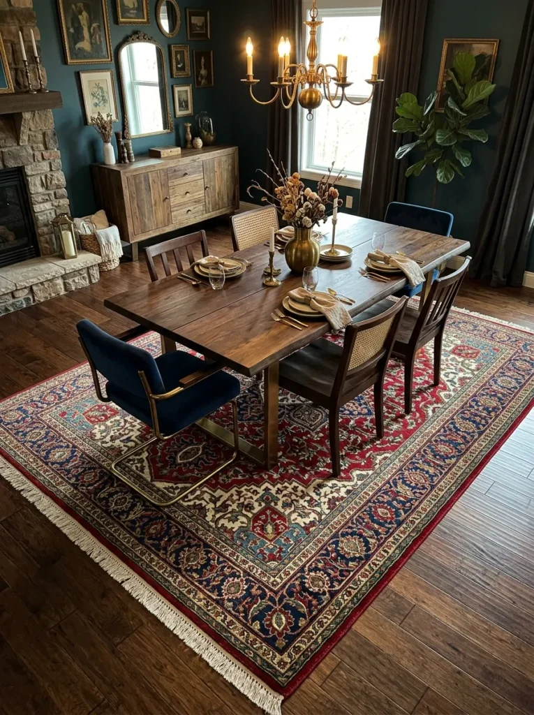
- Anchors the table visually and adds warmth underfoot
- Vintage-style patterns reinforce the eclectic, collected feel
- Muffles sound in rooms with hard flooring
- Adds color and texture without competing with wall treatments
An ornate, patterned area rug underneath the dining table does more than add comfort underfoot — it visually grounds the entire furniture arrangement and adds a layer of color and history that plain flooring can’t provide. Persian-style or vintage-inspired patterns in deep reds, blues, and golds echo the same richness found in jewel-toned walls and drapery, tying the whole room’s palette together cohesively.
Beyond aesthetics, a rug in a dining room with hardwood or tile flooring also softens the sound of chair legs scraping and footsteps, making the space feel calmer during long dinners. I’ve noticed that slightly worn or vintage-style rugs, rather than pristine new ones, fit the eclectic aesthetic more convincingly, adding to that sense of a room furnished over time rather than purchased all at once from a single store.
Sculptural Pendant Lighting
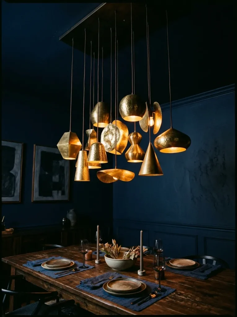
- Adds an artistic, gallery-like focal point overhead
- Clustering multiple pendants creates more visual interest than one fixture
- Sculptural shapes double as functional lighting and decor
- Works especially well over long or oversized tables
For dining rooms with longer tables, a single chandelier sometimes isn’t enough to fill the visual space overhead. Clustering two or three sculptural pendant lights of varying heights and shapes creates an artistic, almost gallery-like statement that functions as both lighting and decor simultaneously. Brass or aged bronze finishes on the pendants tie back naturally to other warm metal accents throughout the room.
This approach also allows for more lighting flexibility, since multiple smaller fixtures can be dimmed or arranged to highlight different sections of a long table during different types of gatherings. I’ve tried this layout in narrow dining rooms where a single oversized chandelier felt overwhelming, and the clustered pendant approach struck a much better balance between drama and proportion, giving the eclectic mix of shapes room to actually breathe.
Layered Console Table Vignette
- Adds function and personality to an underused corner
- Ceramic and brass details reflect candlelight beautifully
- Gives guests something to browse and interact with
- Easy to restyle seasonally with new books, vases, or accents
A console table tucked into a corner of the dining room adds both function and visual interest to a space that often has unused floor area near the walls. Styled with a curated stack of books, a textured vase, and a pair of brass candlesticks, it becomes a functional piece of decor that guests naturally gravitate toward before or after a meal. The ceramic and metal materials also catch and reflect candlelight beautifully, adding sparkle without needing additional light fixtures.
This is one of the easier elements to restyle seasonally or for specific occasions, simply by swapping which books, vases, and accents are on display. I’ve seen this work particularly well in smaller dining rooms lacking a separate lounge or entertaining space, since the console table effectively extends the room’s hosting function without requiring any additional square footage or built-in cabinetry.
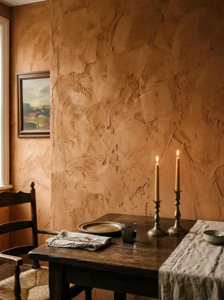
Textured Plaster Walls
- Adds tactile depth that flat paint simply cannot achieve
- Earthy tones like terracotta pair beautifully with dark wood
- Handmade appearance reinforces an authentic, collected feel
- Works well as an alternative to wallpaper or paint alone
Textured plaster finishes bring a tactile, artisanal quality to dining room walls that flat paint alone can’t replicate. A warm terracotta or clay-toned plaster, applied with visible hand-troweled texture, adds organic depth and catches candlelight in a way that creates subtle shadow and highlight across the surface throughout the evening. This finish pairs particularly well with dark wood furniture and brass accents, reinforcing the earthy, collected feel central to elegant eclectic design.
While this update requires more labor than a simple paint job, the payoff in visual richness is considerable. Many designers recommend it specifically for a dining room’s accent wall rather than the entire space, balancing cost against impact. I’ve noticed that rooms with this kind of tactile wall treatment photograph with a warmth and depth that flat paint colors, however deep, often struggle to fully replicate.
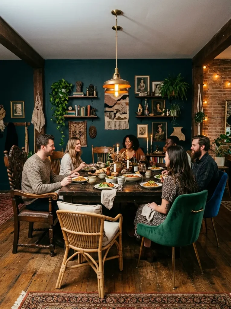
Eclectic Chair Mix
- Reinforces the eclectic half of this design style directly
- Allows mixing thrifted, inherited, and new furniture pieces together
- Adds visual rhythm and interest around the table
- More forgiving and flexible than matching chair sets
Perhaps no single element defines the eclectic side of this aesthetic more than intentionally mismatched dining chairs. Rather than a uniform set of six identical chairs, mixing a carved wood chair at the head of the table with velvet-upholstered chairs along the sides and perhaps a woven rattan option elsewhere creates the sense that the room has been furnished and collected over years rather than bought in one trip.
This approach is also considerably more forgiving for budgets and timelines, since chairs can be added gradually as good pieces are found rather than needing to be purchased all at once. In my experience, the trick to making mismatched chairs look intentional rather than accidental is keeping a consistent color family or wood tone running through the mix, even as the actual shapes and materials vary from chair to chair.
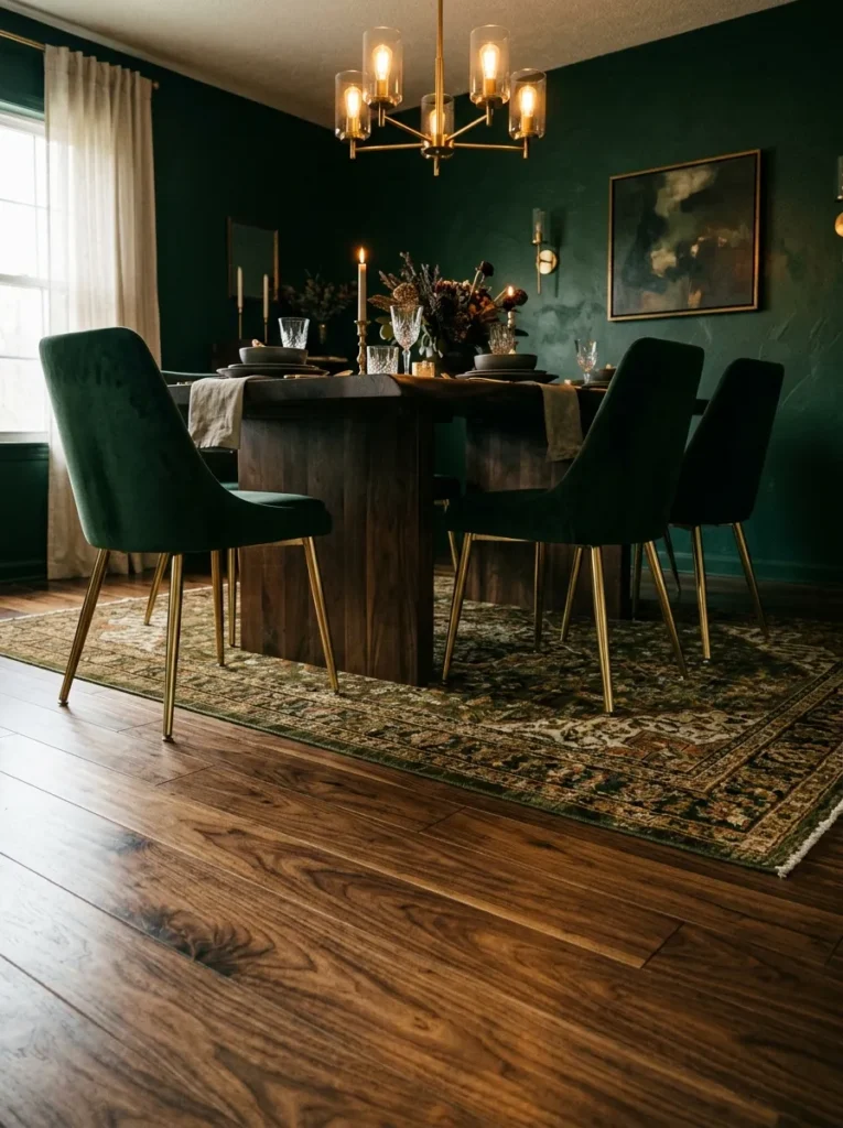
Moody Floral Arrangements
- Softens a dark room with organic, natural texture
- Deep-toned blooms feel intentional rather than overly bright
- Dried and fresh flowers can be combined for texture
- Easy seasonal update that doesn’t require new furniture
Floral arrangements in a moody dining room look best when they lean into the same rich, saturated palette as the rest of the space rather than fighting against it with bright pastels. Deep burgundy dahlias and dried eucalyptus arranged in a brass or dark ceramic vase feel like a natural extension of the room’s existing color story rather than a separate decorative element competing for attention.
Combining fresh blooms with dried stems also extends the arrangement’s lifespan and adds interesting textural contrast between soft petals and papery, dried foliage. I’ve tried this approach for both everyday styling and special dinners, and the deep-toned floral choice consistently reads as more sophisticated in photographs than brighter, more traditional arrangements would in the same moody setting.
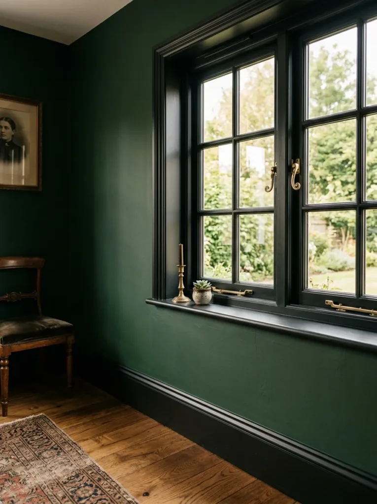
Dark Trim Details
- Creates seamless, immersive color throughout the room
- Hides scuffs and marks better than white trim
- Makes windows and doorways feel more architectural
- A subtle detail that ties the whole room together
Painting trim, baseboards, and window frames to match or complement the wall color, rather than defaulting to white, removes the visual break that traditional trim creates and allows the room’s color scheme to feel fully immersive from floor to ceiling. Black or deep charcoal trim against emerald or navy walls in particular gives windows and doorways a more architectural, gallery-like presence.
This is a detail many homeowners overlook entirely, assuming white trim is simply the default. Dark trim also holds up better against daily wear, since scuffs and fingerprints show far less than they would against crisp white paint. I’ve seen this small change alone shift a dining room from looking like a standard builder-grade space to something that feels custom-designed, all for the cost of a can of paint and a weekend project.
Statement Art Piece
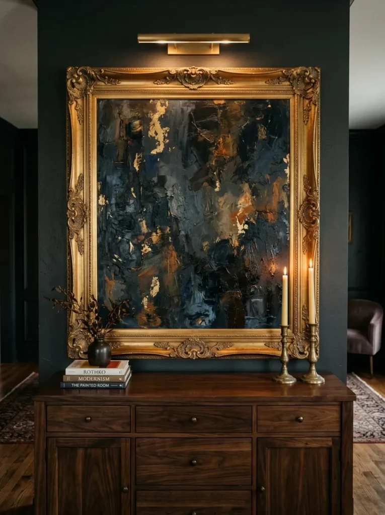
- Gives the room an immediate gallery-worthy focal point
- Large scale prevents a wall from feeling underdressed
- Original or vintage pieces add authentic character
- Anchors the eye before smaller details are noticed
While a gallery wall works well for collected variety, sometimes a single, oversized statement art piece makes a stronger impact in a moody dining room. A large dark abstract painting or vintage oil portrait, hung in a substantial gold or dark wood frame above a buffet or console, immediately becomes the room’s focal point, giving the eye somewhere to land before taking in smaller details like candlesticks or table linens.
Vintage or estate-sale artwork tends to fit this aesthetic more naturally than mass-produced prints, since the slight wear and unique subject matter reinforce the eclectic, collected feeling. I’ve noticed that even a single well-chosen large piece can make an entire room feel complete, functioning almost like the finishing touch that ties the wall color, furniture, and lighting choices together into one cohesive story.
Warm Wood Flooring
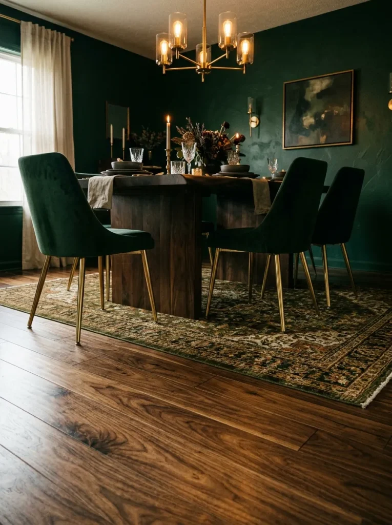
- Grounds the whole room in natural warmth underfoot
- Deep wood tones hide scratches better than pale finishes
- Complements both formal and eclectic furniture choices
- A worthwhile investment that outlasts trend-driven updates
Flooring often gets overlooked in dining room makeovers since it’s harder and more expensive to change than paint or furniture, but warm-toned hardwood underfoot makes a real difference in how grounded and cohesive the whole room feels. A rich walnut or chestnut stain works especially well beneath dark furniture and jewel-toned walls, since it continues the same deep, warm palette from floor to ceiling rather than introducing a cooler, contrasting tone.
For those not ready for a full flooring replacement, refinishing existing wood floors in a darker stain is often a more affordable path to the same effect. I’ve noticed that homeowners investing in this update tend to see it pay off over many years, since flooring is one of the few elements in this list that isn’t subject to changing trends the way paint colors or textiles can be.
Layered Candle Heights
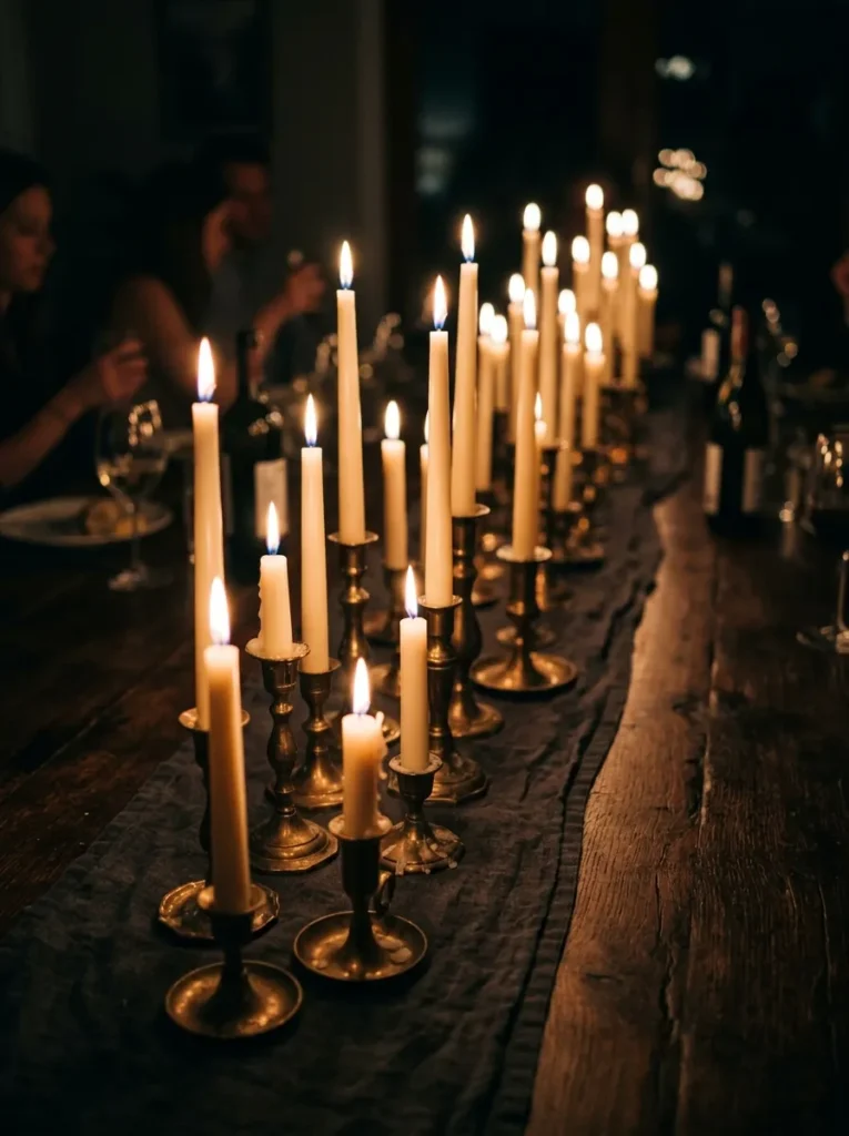
- Creates rhythm and visual movement down the table
- Mixing heights avoids a flat, uniform look
- Inexpensive way to add drama to any dinner setting
- Works alongside floral or greenery centerpieces easily
Building on candlelight as a centerpiece element, paying attention to the varying heights of candles used creates additional visual rhythm down the length of the table. Rather than lining up identical taper candles at one uniform height, mixing shorter votives with taller tapers and the occasional pillar candle creates a more dynamic, layered silhouette that catches the eye and casts more interesting shadows across the table’s surface.
This kind of layering costs very little beyond the candles themselves, making it one of the most accessible upgrades on this entire list. I’ve tried arranging candles this way alongside a simple runner of greenery, and the combination consistently creates a tablescape that feels considered and elegant even on an ordinary weeknight, not just for special occasions when more elaborate styling might otherwise be reserved.
Vintage China Display
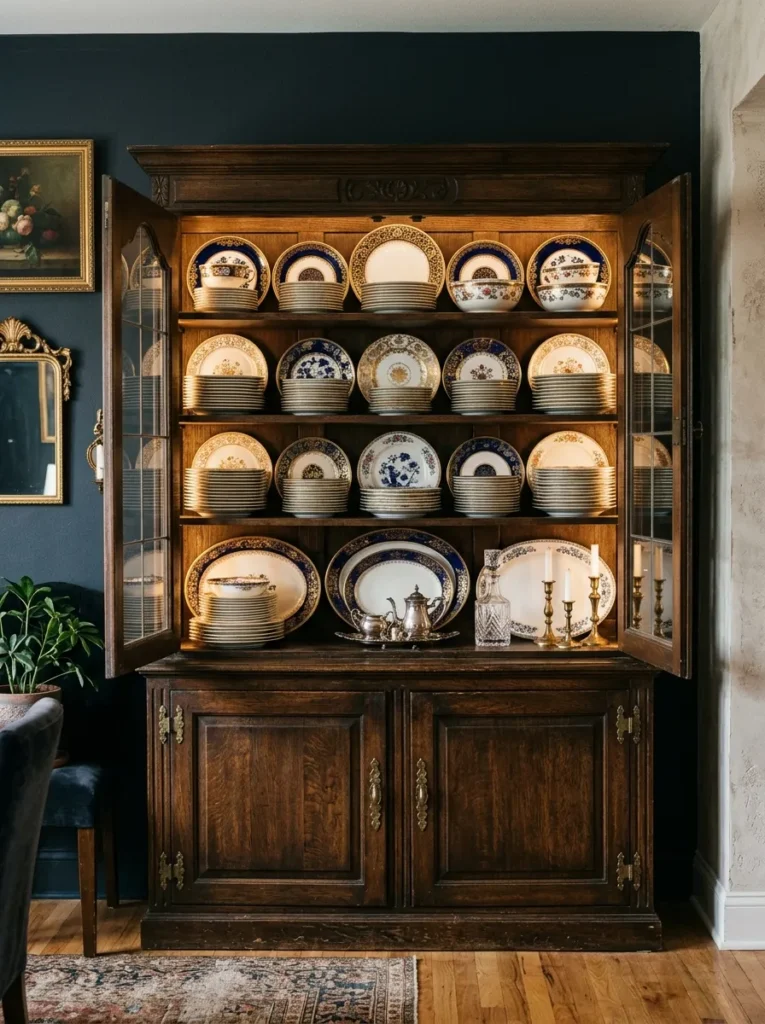
- Turns everyday dishware into a decorative focal point
- Inherited or thrifted china adds authentic history to the room
- Open shelving keeps the collection visible rather than hidden
- Patterns and colors can echo other elements in the room
Displaying vintage china openly on shelving or in a glass-front hutch transforms dishware from purely functional items into an intentional design feature. Deep blue and gold patterned plates, especially ones inherited from family or found at estate sales, bring genuine history and authenticity into the room that new dishware simply cannot replicate. Arranging them by color or pattern on open shelves also adds a layer of visual texture to walls that might otherwise remain empty.
This approach works particularly well for households already holding onto sentimental dishware that rarely gets used for everyday meals. I’ve seen this work beautifully in dining rooms lacking built-in storage, where a single freestanding hutch became both functional storage and the room’s most talked-about decorative feature. The colors and patterns within the china can also be echoed elsewhere in the room, from table linens to floral arrangements, tying the whole space together.
Conclusion
Creating a moody dining room is less about following a strict formula and more about layering rich colors, warm metals, and pieces gathered with intention over time. From deep emerald walls to a well-loved vintage hutch, each of these moody dining room ideas can stand alone or work together to build a space that feels elegant, eclectic, and entirely your own. I’ve seen how small changes like a new chandelier or a handful of taper candles can completely transform the feeling of a room without a full renovation. Save this post to Pinterest, try one idea this weekend, and share it with a friend who’s ready to give their own dining room a little more drama and warmth.
One Comment