
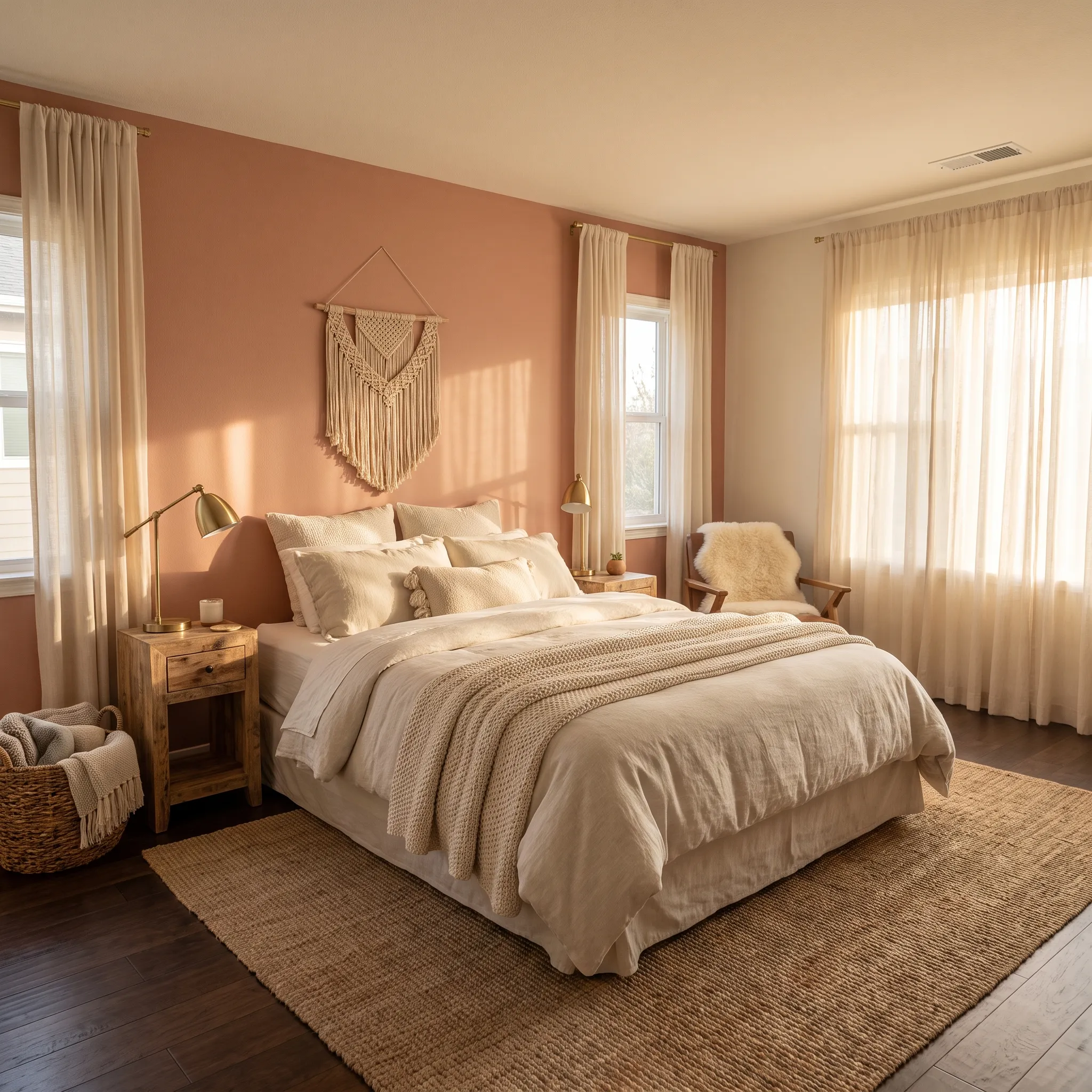
21 Bedroom Color Schemes Cozy Stylish Retreat
1. Warm Terracotta Tones
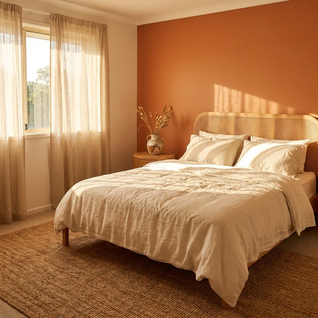
- Adds instant warmth without feeling overwhelming
- Pairs beautifully with natural wood and rattan textures
- Works in both small and large bedrooms
- Feels grounded, cozy, and sun-washed year-round
Terracotta brings a sun-baked warmth that instantly softens a bedroom’s mood. It’s one of those tones that feels lived-in from day one, pulling in shades of clay, rust, and warm sand without ever feeling loud. In my experience, this palette works especially well in rooms that get plenty of natural light, since the warmth bounces off walls and bedding in a way that feels almost golden. Pairing terracotta with linen textures and light wood furniture keeps the space grounded rather than heavy. It’s a color choice that feels intentional, calm, and effortlessly inviting for anyone drawn to earthy interiors.
What makes this palette effective is how adaptable it feels across different bedroom sizes. A single terracotta accent wall can transform a plain room, while terracotta-toned textiles soften a space that already has strong architectural features. The color reads as warm rather than bold, so it rarely competes with other design choices in the room. Layering in cream, sand, or soft white keeps the palette breathable and prevents it from feeling too saturated. Many bedroom color schemes lean cool or neutral, so terracotta stands out as a refreshing, cozy alternative that still photographs beautifully and feels genuinely restful to live in.
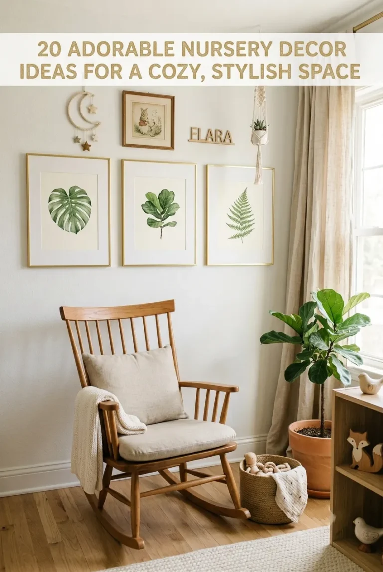
you may also like: 20 Adorable Nursery Decor Ideas
2. Soft Sage Green
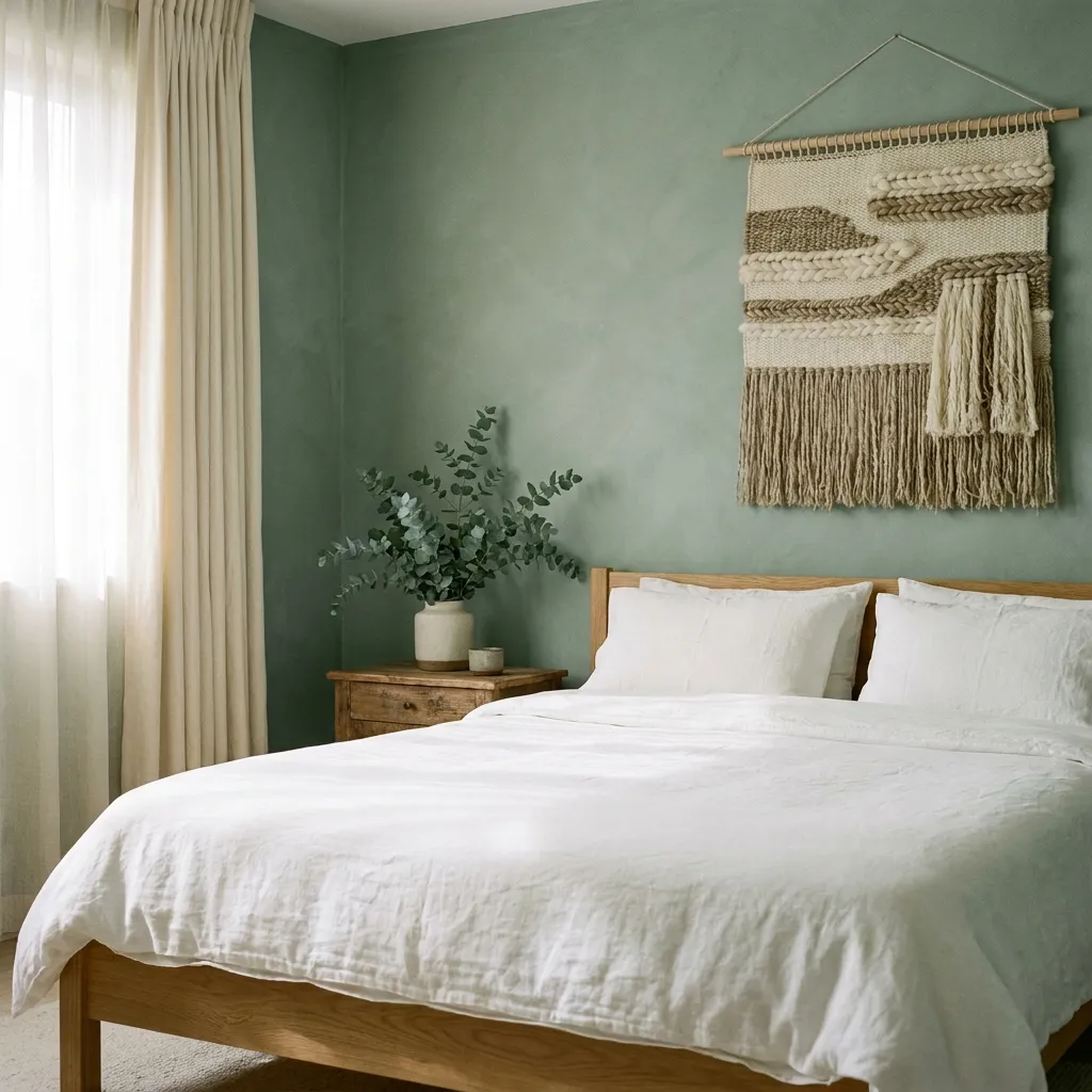
- Brings a calming, nature-inspired feel to any room
- Softens harsh light without dulling the space
- Blends easily with wood, cream, and white tones
- Suits both modern and cottage-style bedrooms
Sage green has a quiet, calming quality that makes it one of the most requested shades for restful spaces. It sits somewhere between gray and green, which gives it a softness that never feels cold or clinical. I’ve noticed this shade works particularly well in bedrooms with lots of natural wood, since the warmth of the wood balances the coolness of the green. It also photographs beautifully in both morning and evening light, shifting subtly throughout the day. For anyone wanting a bedroom that feels connected to nature without going fully rustic, sage green offers a gentle, grounded middle ground.
The real strength of sage green lies in its flexibility. It works as a full wall color, a single accent wall, or even just through bedding and pillows if a full repaint feels like too much of a commitment. Cream, ivory, and soft brown all sit naturally alongside it, which makes styling straightforward even for beginners. This shade also tends to age well, staying relevant instead of feeling trendy for a season and outdated the next. It’s a dependable, versatile choice that brings quiet sophistication and a lasting sense of calm to a bedroom.
3. Moody Charcoal Walls
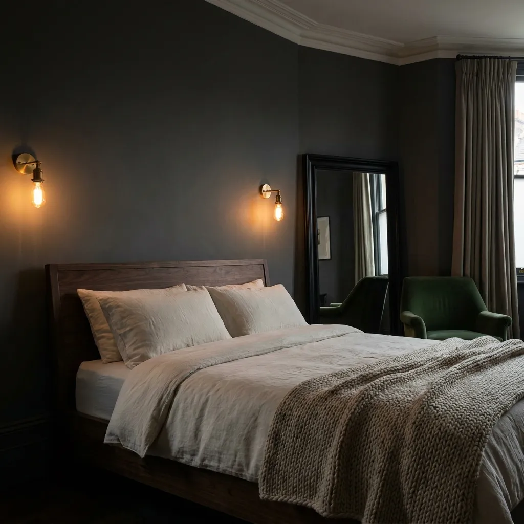
- Creates a cocoon-like, restful sleeping environment
- Makes brass and gold accents stand out beautifully
- Hides scuffs and wear better than lighter shades
- Feels luxurious without requiring expensive furniture
Charcoal walls turn a bedroom into a true retreat, something closer to a boutique hotel room than an ordinary space. The depth of the color absorbs light rather than reflecting it, which naturally makes the room feel quieter and more enclosed at night. That’s why many designers recommend this shade for primary bedrooms, where the goal is rest rather than brightness. Charcoal also has a way of making warm metals like brass and gold look richer, almost glowing against the dark backdrop. It’s a bold move, but one that consistently reads as elegant rather than heavy when balanced correctly.
Balance is the key word with a charcoal palette. Bright white trim, soft textiles, and warm lighting keep the room from feeling like a cave, while still preserving that cozy, tucked-away feeling people love. Layered lighting matters more here than in lighter rooms, so lamps and sconces should be added generously. Charcoal also pairs surprisingly well with soft pastels, letting a single blush or sage accent stand out dramatically. For anyone who finds all-white bedrooms sterile, charcoal offers the opposite experience: warm, private, and quietly dramatic in the best possible way.
4. Blush Pink Accents
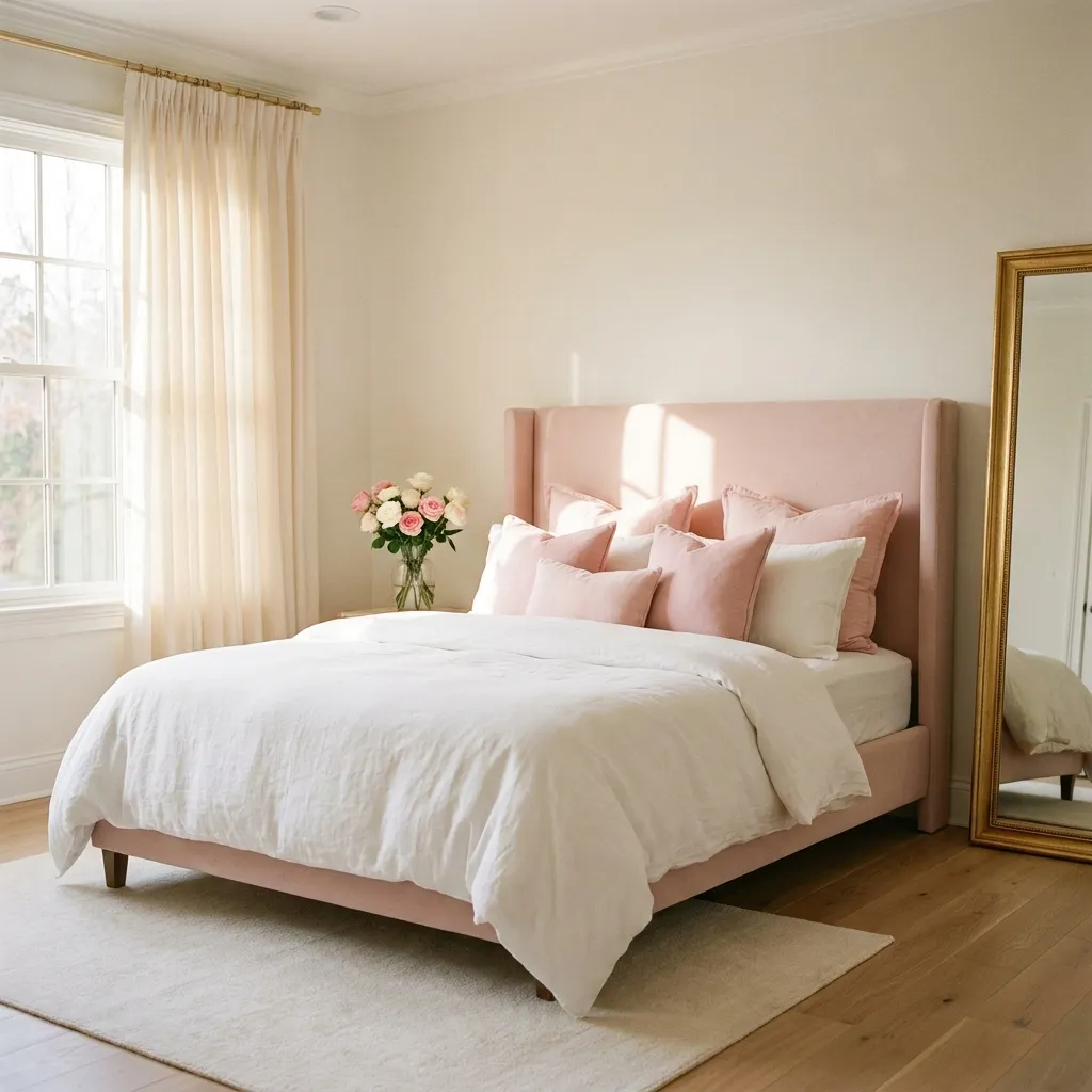
- Softens a room without feeling overly sweet
- Pairs effortlessly with gold, cream, and white
- Suits guest rooms, primary bedrooms, and nurseries alike
- Adds a romantic touch without a full repaint
Blush pink has moved far beyond being just a “girly” color choice, and now shows up in bedrooms of every style. Its muted, dusty undertone keeps it sophisticated rather than saccharine, especially when it’s introduced through fabric and accents instead of covering every wall. I’ve tried this approach in smaller guest rooms, and it consistently makes the space feel warmer and more welcoming within minutes. Blush works particularly well against neutral backdrops, letting the pink read as a gentle highlight rather than the dominant feature. It’s an approachable way to add personality without overwhelming the rest of the room’s design.
The versatility of blush comes from how easily it shifts tone depending on what surrounds it. Against warm woods and gold accents, it leans romantic and vintage. Against black or charcoal, it feels modern and unexpected. Even a single upholstered headboard or a set of patterned pillows can introduce the shade without any long-term commitment. This makes blush an ideal starting point for anyone hesitant about color, since it can be added gradually through textiles before considering paint. It’s a soft, forgiving shade that consistently performs well across different bedroom color schemes and personal style preferences.
5. Coastal Blue Hues
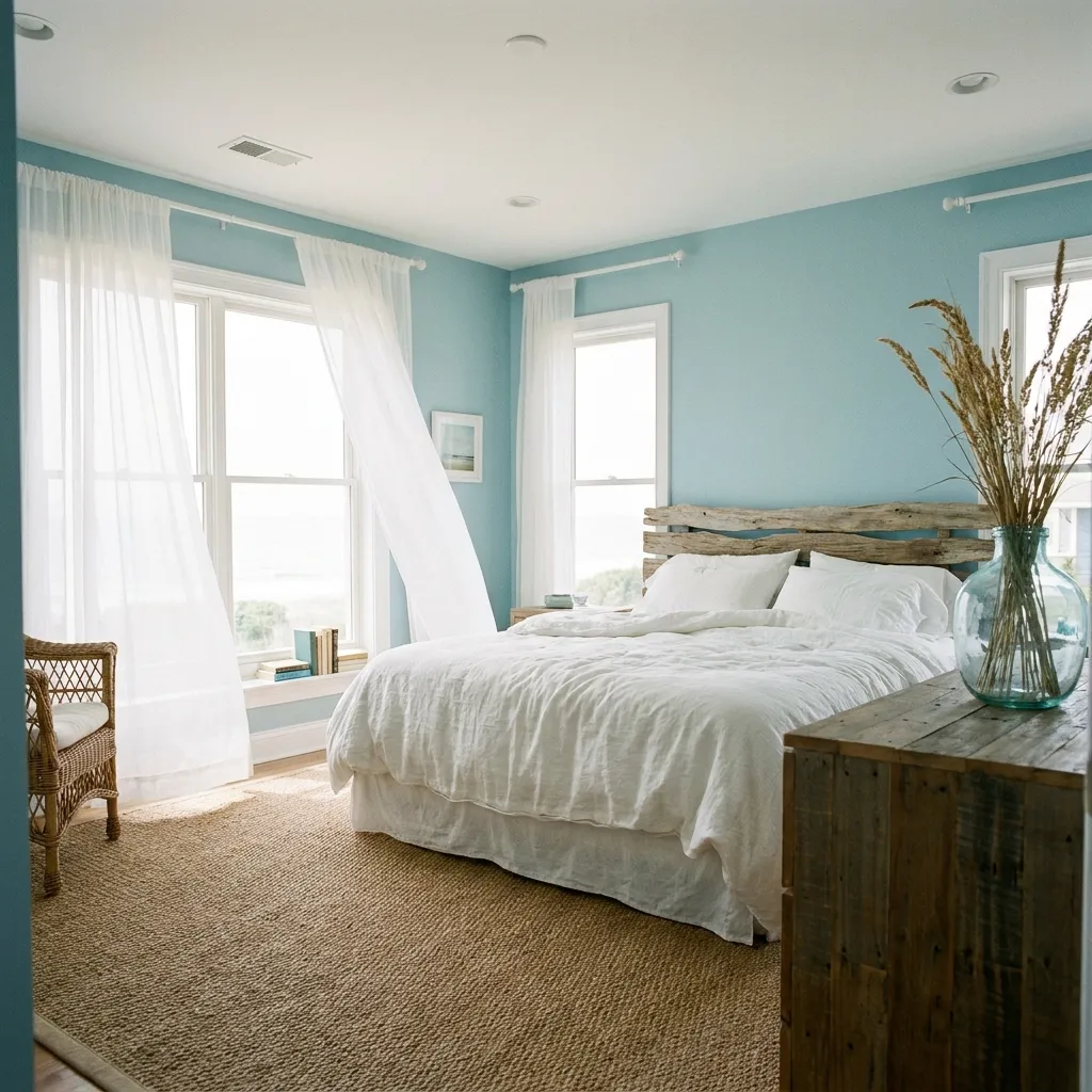
- Brings a calm, breezy feel reminiscent of the seaside
- Works especially well in rooms with lots of natural light
- Pairs naturally with white, sand, and driftwood textures
- Keeps a room feeling fresh even in warmer climates
Coastal blue tones have a way of making a bedroom feel instantly lighter and more open, even in spaces that don’t get much natural sunlight. The shade sits between sky and sea, cool enough to feel refreshing but never cold or sterile. In my experience, this palette performs best when paired with plenty of white and natural texture, since the contrast keeps the room from leaning too nautical or theme-heavy. It’s a color that suits both true coastal homes and inland bedrooms simply looking to capture that same relaxed, breezy energy year-round without needing an ocean view outside the window.
What sets coastal blue apart from other blues is its restraint. It avoids the deep, moody feel of navy while staying more grounded than a pale baby blue. Sandy neutrals, driftwood tones, and woven textures all complement it naturally, which keeps styling simple even for smaller bedrooms. Sheer curtains and layered white bedding help the color feel light rather than flat. This palette also tends to work beautifully across seasons, feeling appropriate whether it’s the middle of summer or the depths of winter, which makes it a genuinely low-maintenance long-term choice.
6. Warm Neutral Layers
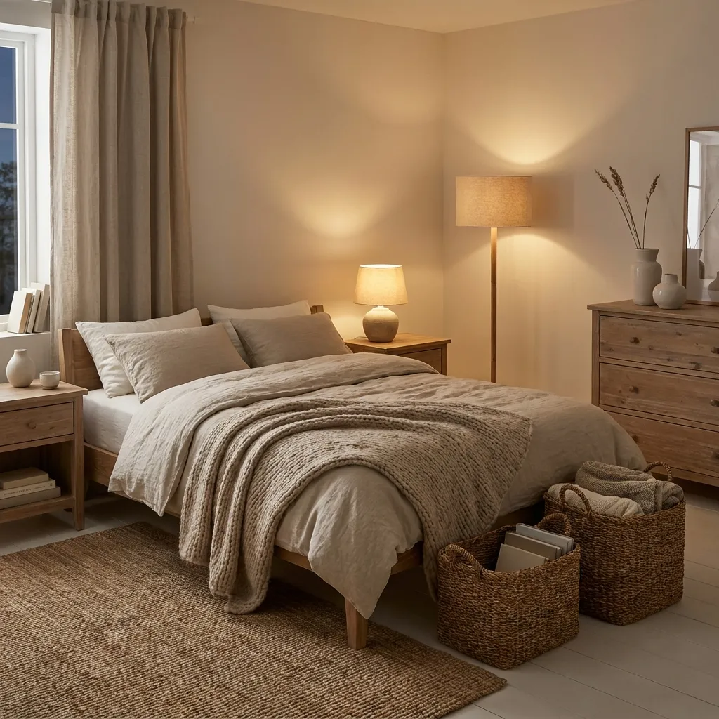
- Creates depth without relying on bold color
- Feels timeless and rarely needs updating
- Easy to layer with different textures and materials
- Suits minimalist and traditional bedrooms equally well
Warm neutrals prove that a bedroom doesn’t need bright color to feel rich and inviting. Instead of relying on a single dominant shade, this approach layers beige, taupe, cream, and soft brown together to build depth through variation rather than contrast. I’ve noticed that rooms built this way tend to feel more expensive than their actual furnishings suggest, simply because the tonal layering reads as intentional and considered. Texture becomes especially important here, since flat surfaces can make a neutral room feel plain. Wool, linen, and natural wood all add the visual interest that color alone would normally provide.
The biggest advantage of warm neutral layering is its longevity. Unlike trend-driven color choices, this palette rarely feels dated, which makes it a practical option for anyone not wanting to repaint every few years. It also serves as an excellent base for seasonal styling, since pillows, throws, and artwork can be swapped without clashing with the walls. Small metallic or wood accents add just enough contrast to keep the room from feeling flat. For bedrooms meant to feel calm, grown-up, and quietly elegant, warm neutral layering remains one of the most reliable design approaches available.
7. Deep Emerald Green
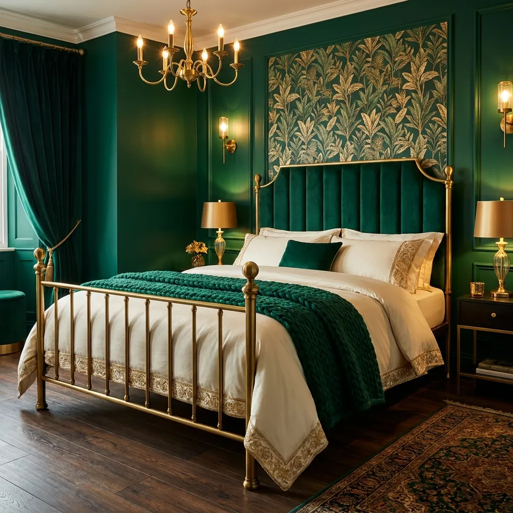
- Adds a jewel-toned richness rarely seen in bedrooms
- Pairs beautifully with brass, gold, and dark wood
- Makes a strong style statement in primary bedrooms
- Balances well against lighter ceilings and trim
Emerald green carries a richness that instantly elevates a bedroom’s atmosphere, giving it the feel of a boutique hotel suite rather than a standard sleeping space. This deep, saturated tone works best as an intentional style statement, often applied to a single feature wall or paired with matching velvet textiles. That’s why many designers recommend keeping the rest of the room’s palette simple, letting emerald do the visual heavy lifting. Gold and brass hardware bring out the warmth hidden within the green, while dark wood flooring grounds the space so it never feels overly saturated or theatrical.
Because emerald is such a bold choice, balance becomes essential to making it work long-term. Lighter ceilings, cream trim, and soft ivory bedding all help prevent the room from feeling closed in, especially in bedrooms without abundant natural light. Layered lighting, including warm lamps and dimmable fixtures, enhances the jewel-toned quality of the walls after dark. This palette suits people who want their bedroom to feel distinctly personal and memorable rather than blending into a generic neutral trend. Done well, emerald green results in a space that feels intentional, luxurious, and genuinely one of a kind.
8. Creamy Vanilla Palette
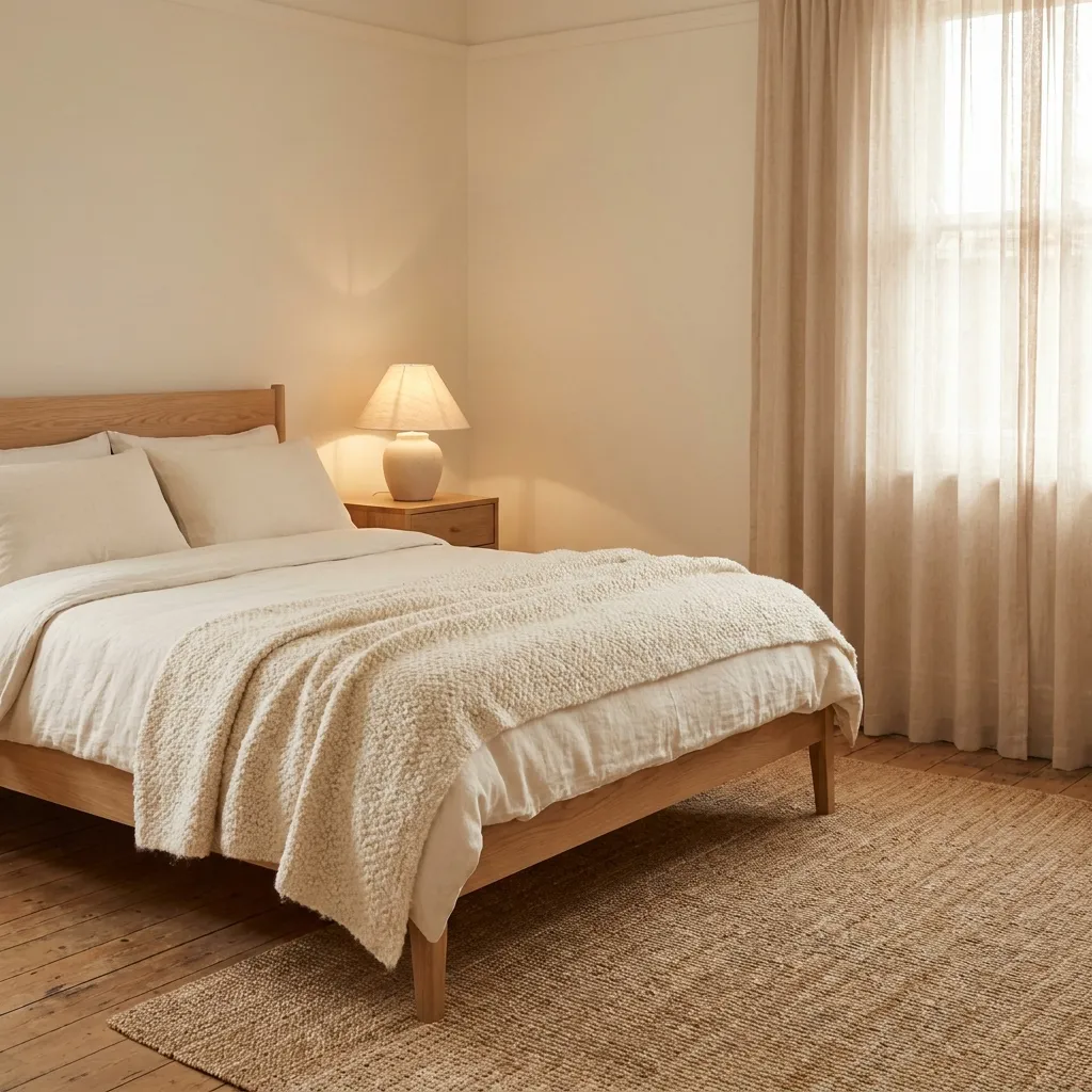
- Creates a warm, soothing backdrop for better sleep
- Works well in rooms lacking abundant natural light
- Complements almost any furniture style or wood tone
- Feels warm without leaning too yellow or beige
Creamy vanilla tones offer a softer alternative to stark white, giving a bedroom warmth without introducing a strong color statement. This shade tends to work especially well in rooms that don’t receive much natural light, since it reflects warmth rather than reading as flat or cold the way pure white sometimes can. I’ve seen this work well in many homes where homeowners wanted a neutral base but found white too sterile and beige too heavy. Vanilla sits comfortably between the two, offering the brightness of white with just enough warmth to feel inviting rather than clinical.
This palette’s biggest strength is its ability to serve as a flexible backdrop for almost any styling direction. Wood furniture, metal accents, and colorful textiles all sit comfortably against creamy vanilla walls without clashing. It also photographs well in nearly any lighting condition, which matters for anyone documenting their home for Pinterest or social sharing. Because the tone is so gentle, mistakes in styling are much easier to correct than with bolder colors. For a bedroom meant to feel calm, adaptable, and quietly warm, a creamy vanilla palette remains a dependable and easy starting point.
9. Dusty Lavender Shades
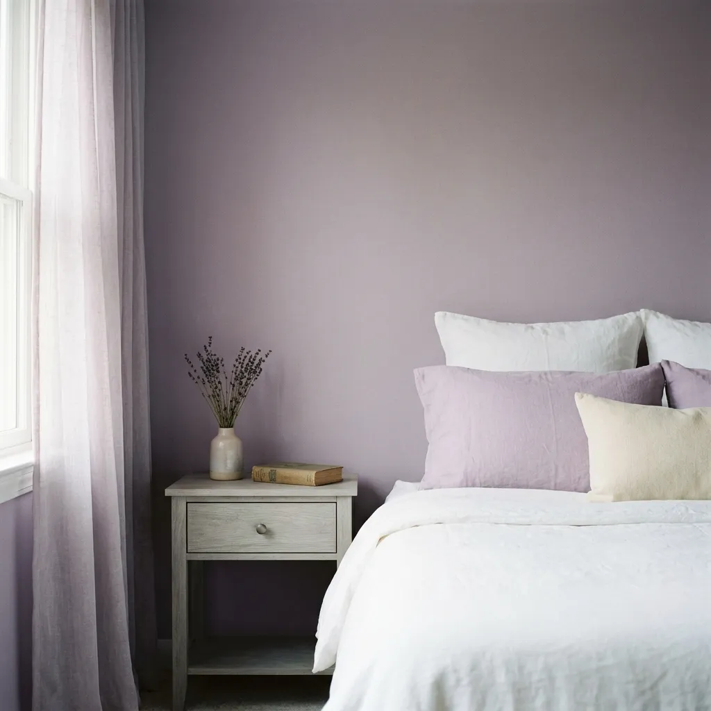
- Adds gentle color without feeling overly sweet or bright
- Works beautifully with gray, cream, and silver tones
- Suits bedrooms designed for relaxation and calm
- Feels sophisticated rather than overly delicate
Dusty lavender occupies a unique space between purple and gray, giving it a muted sophistication that avoids feeling childish or overly sweet. It works particularly well in bedrooms meant purely for winding down, since the cooler undertones have a naturally calming effect on the eye. In my experience, this shade performs best when kept slightly desaturated, since a brighter lavender can quickly tip into looking too playful for an adult bedroom. Paired with soft grays and warm whites, dusty lavender reads as elegant and restful rather than decorative, making it a strong choice for primary bedrooms.
Styling around dusty lavender is easier than most people expect, since it behaves much like a neutral once muted correctly. Silver and brushed nickel hardware complement its coolness, while natural wood introduces just enough warmth to keep the room balanced. Layered textiles in cream or soft gray help the lavender feel intentional rather than accidental. This shade also transitions beautifully between seasons, feeling just as fitting in winter as it does in spring. For anyone wanting color without sacrificing a calm, grown-up atmosphere, dusty lavender delivers a quietly distinctive result.
10. Rich Chocolate Brown
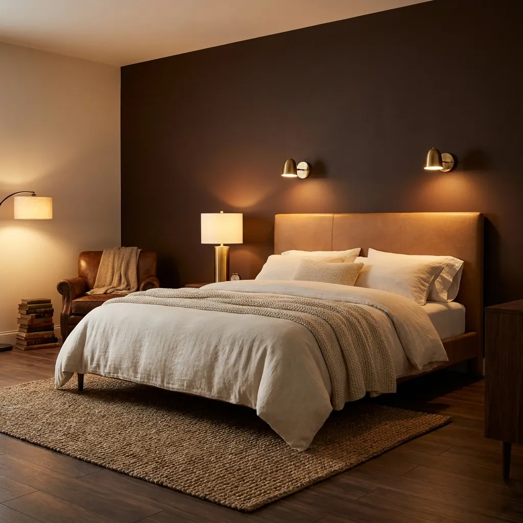
- Brings depth and warmth without feeling too dark
- Pairs naturally with camel, cream, and brass tones
- Suits bedrooms wanting a grounded, cozy atmosphere
- Works well as a full wall or accent feature
Rich chocolate brown has quietly become one of the most popular deep tones for bedrooms, offering warmth and depth without the starkness of black or charcoal. This shade feels grounded and enveloping, almost like being wrapped in a cozy blanket the moment you walk into the room. I’ve noticed that chocolate brown works especially well in bedrooms with warm wood flooring, since the two tones blend seamlessly rather than competing. Cream and camel accents lighten the overall mood, keeping the space from feeling too heavy while still preserving that rich, comforting atmosphere the color is known for.
This palette suits a variety of bedroom styles, from modern minimalist spaces to more traditional, layered interiors. Brass and gold hardware bring out warm undertones hidden within the brown, while soft ivory bedding provides visual relief against the deeper wall color. Chocolate brown also photographs beautifully under warm lamp lighting, making it a favorite for evening ambiance. For anyone drawn to earthy, grounded bedroom color schemes but hesitant about extremely dark shades like black, chocolate brown offers a comforting middle ground that feels both stylish and genuinely restful.
11. Soft Butter Yellow
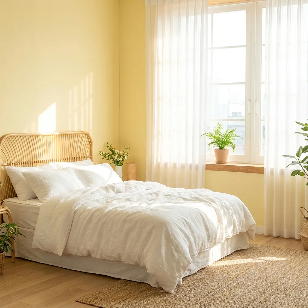
- Brings a cheerful, sunny feeling into the bedroom
- Works well in rooms lacking strong natural light
- Pairs easily with white, cream, and natural wood
- Feels fresh without becoming overly bright or bold
Soft butter yellow brings a gentle cheerfulness to a bedroom that few other colors can replicate. Unlike bright, saturated yellows, this muted version feels warm and welcoming rather than overstimulating, making it suitable even for a primary bedroom meant for rest. It’s especially effective in rooms that don’t get much direct sunlight, since the color itself seems to generate a soft glow throughout the day. Among the many bedroom color schemes built around light, cheerful tones, butter yellow stands out for how naturally it balances warmth and calm without ever feeling like a compromise between the two extremes.
Pairing butter yellow with white and natural wood keeps the palette airy rather than overwhelming, allowing the color to feel like a gentle accent instead of the entire room’s identity. Woven textures, rattan furniture, and linen bedding all complement the shade’s softness beautifully. This color also works particularly well for guest rooms or bedrooms belonging to people who want a genuinely uplifting space to wake up in each morning. Because it leans soft rather than saturated, butter yellow rarely feels dated, remaining a cheerful and dependable choice across changing design trends.
12. Muted Clay Pink
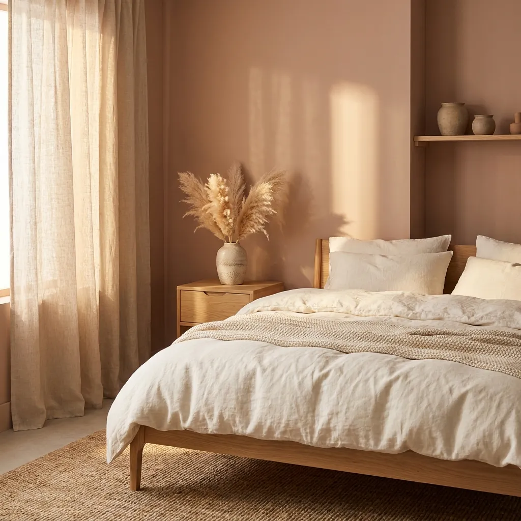
- Softens a space while keeping an earthy, grounded feel
- Pairs naturally with cream, terracotta, and warm wood
- Feels sophisticated rather than overly delicate or bright
- Suits both minimalist and boho-inspired bedrooms
Muted clay pink sits at the intersection of pink and terracotta, offering warmth without leaning fully into either shade. This dusty, earthy tone feels far more grounded than a traditional blush, making it a favorite among people who want color without sacrificing a calm, minimalist atmosphere. I’ve tried this shade in bedrooms with heavy natural texture, like linen and jute, and it consistently reads as sophisticated rather than soft or overly sweet. Clay pink also has a way of looking slightly different depending on the time of day, shifting from warm and glowing in the morning to muted and soft by evening.
Because this shade behaves almost like a neutral, styling around it is fairly forgiving. Cream, ivory, and warm wood tones all sit naturally alongside clay pink, while a touch of terracotta or rust adds depth without clashing. This palette works particularly well in boho-inspired bedrooms, where natural materials and muted colors are already central to the design language. For anyone drawn to blush pink but wanting something slightly more grounded and less traditionally feminine, muted clay pink offers a similar softness with a noticeably more sophisticated, earthy edge.
13. Navy And Gold

- Creates a classic, timeless bedroom aesthetic
- Makes gold and brass accents genuinely shine
- Feels formal enough for a primary suite
- Works well in both traditional and modern spaces
Navy paired with gold is one of the most enduring combinations in interior design, and it translates beautifully into bedroom spaces. The deep blue provides a rich, restful backdrop, while gold accents introduce just enough shine to keep the room from feeling flat or overly serious. That’s why many designers recommend this combination for primary suites, where the goal is often a sense of quiet formality and comfort. Navy also tends to photograph exceptionally well, holding its depth under both natural daylight and warm evening lamp lighting without shifting into a flat, muddy tone.
What makes navy and gold so reliable is how well it adapts across different design styles. In a traditional bedroom, it feels classic and timeless, while in a modern space, the same pairing reads as sleek and intentional. Ivory or cream bedding softens the navy’s intensity, preventing the room from feeling too dark or heavy overall. Brass lighting fixtures and gold-framed artwork complete the look without requiring an extensive renovation. For anyone wanting a bedroom color scheme that feels elegant and put-together with minimal ongoing effort, navy and gold consistently delivers.
14. Earthy Olive Tones
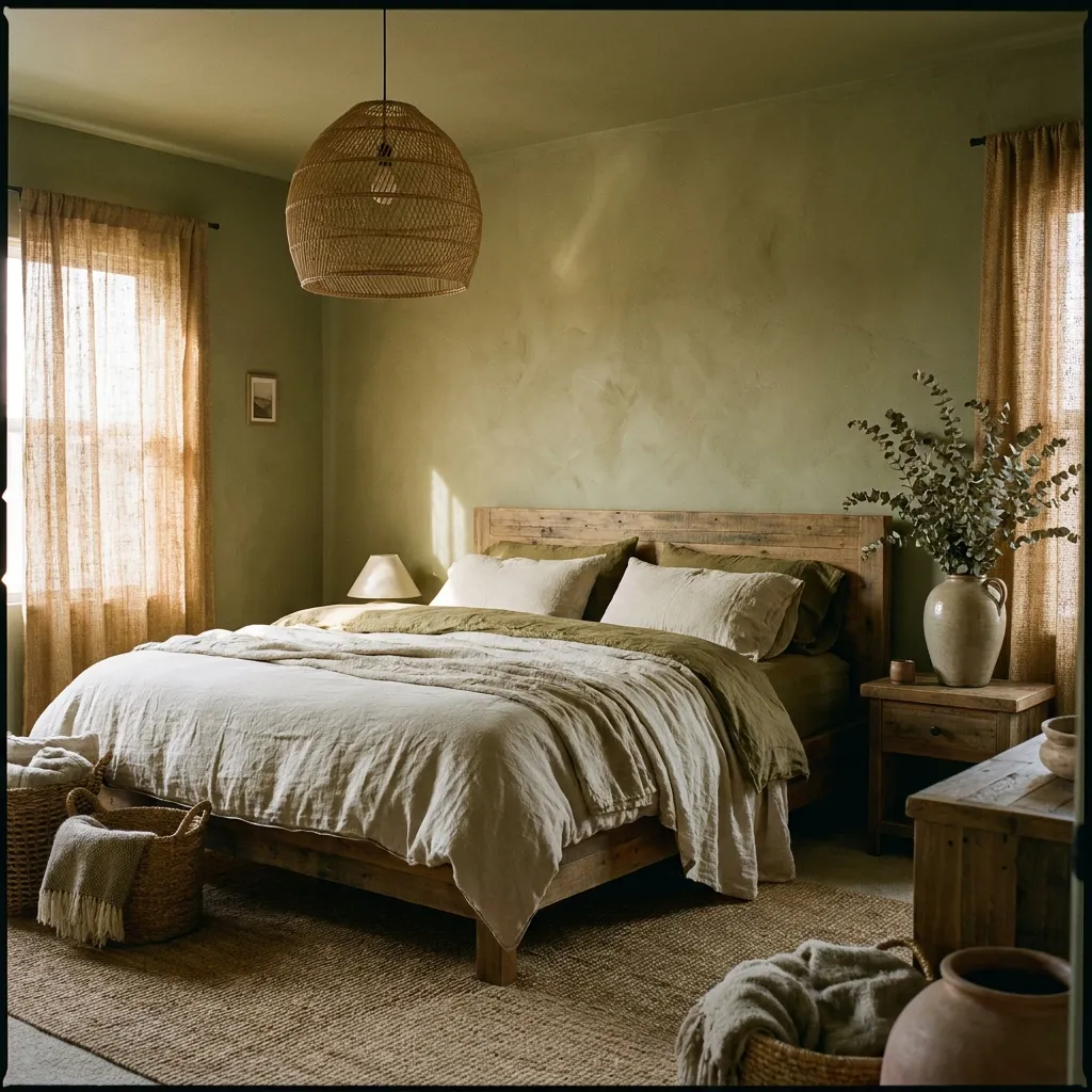
- Brings a grounded, nature-inspired feel to the bedroom
- Pairs beautifully with rattan, wood, and cream tones
- Suits earthy, organic, and boho-style interiors
- Feels warm rather than cold like some green shades
Olive green brings an earthy, grounded quality to a bedroom that feels distinctly different from cooler greens like sage or emerald. Its muted, brownish undertone gives it warmth, making the color feel more like a natural extension of wood and linen than a traditional paint choice. I’ve noticed this shade works particularly well in bedrooms styled around natural materials, since olive practically disappears into a room built around rattan, wood, and woven textures rather than standing out as a bold statement. It’s a color that feels quietly confident, offering personality without ever demanding attention the way brighter greens sometimes do.
Because olive reads as warm rather than cold, it pairs easily with cream, tan, and other earthy neutrals without requiring careful color matching. This makes it an approachable option for anyone nervous about committing to a stronger green tone. Natural light enhances olive beautifully, bringing out subtle golden undertones throughout the day. Olive also tends to suit bedrooms with plants and greenery, since the wall color echoes the living elements in the room rather than competing with them. For an organic, calming bedroom atmosphere, earthy olive tones remain a consistently underrated choice.
15. Warm Taupe Palette
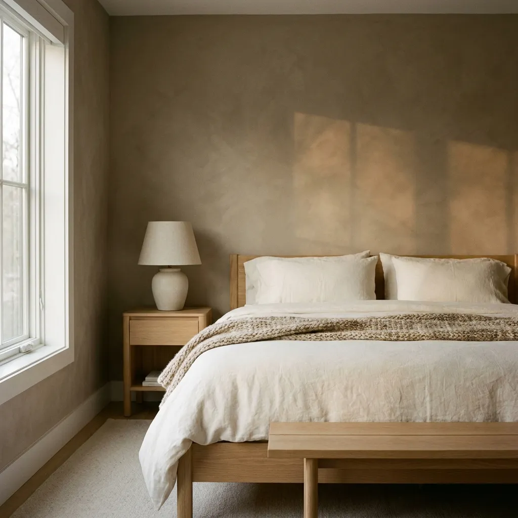
- Feels sophisticated without leaning cold or stark
- Works as a dependable base for any accent color
- Suits both modern and traditional bedroom styles
- Rarely feels dated compared to trend-driven shades
Warm taupe sits comfortably between beige and gray, offering a sophisticated neutral that avoids the coldness sometimes associated with pure gray walls. This shade has real staying power, since it doesn’t chase passing trends the way bolder colors sometimes do. In my experience, taupe works exceptionally well as a foundation color, allowing homeowners to change accent pillows, artwork, and throws seasonally without ever needing to repaint. It photographs beautifully under most lighting conditions, holding a warm, gentle glow rather than reading as flat or gray, which makes it a favorite among people documenting their spaces for inspiration boards.
The dependability of warm taupe makes it especially useful for anyone unsure about committing to a bolder wall color. It complements nearly every wood tone, from light oak to darker walnut, and pairs just as easily with gold, silver, or black hardware. Because the shade sits so close to true neutral, mistakes in styling are difficult to make, which takes pressure off the decorating process. For bedrooms meant to feel calm, adaptable, and quietly elegant over the long term, a warm taupe palette remains one of the most reliable and forgiving choices available.
16. Dusty Rose Walls
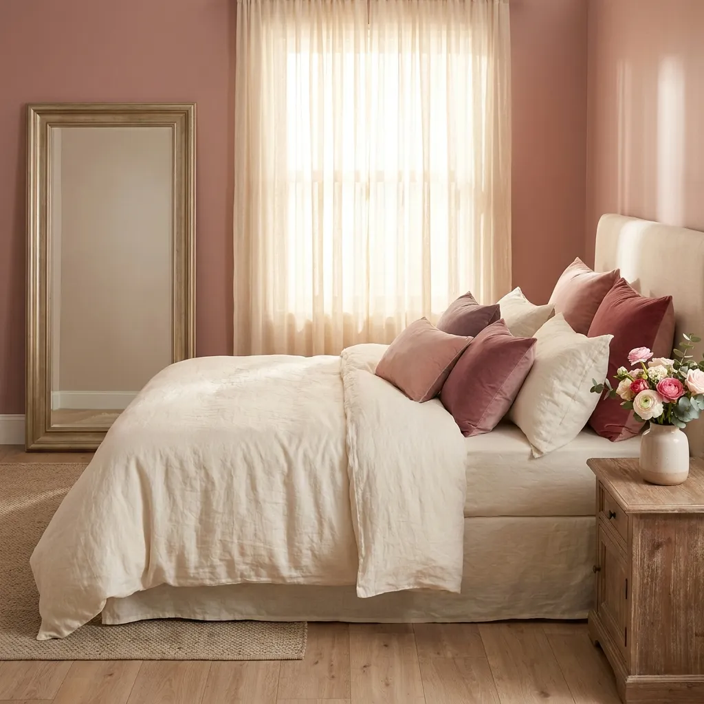
- Adds a romantic, soft touch without feeling childish
- Pairs beautifully with gold, cream, and warm wood
- Suits primary bedrooms and guest rooms alike
- Feels grown-up compared to brighter pink shades
Dusty rose offers a more mature take on pink, muted just enough to feel sophisticated rather than playful. This shade works particularly well as a full wall color, something brighter pinks rarely achieve without overwhelming a space. I’ve seen this work well in many homes where the goal was a romantic feel without leaning too young or overly sweet. The muted undertone allows dusty rose to sit comfortably alongside warm metals and natural wood, creating a palette that feels intentional and considered rather than themed. It’s a color that consistently surprises people with how grown-up and elegant it can look when styled thoughtfully.
Warm gold accents bring out the richness hidden within dusty rose, while cream and ivory textiles keep the overall mood soft and airy. This palette also works beautifully in rooms with abundant natural light, since sunlight enhances the color’s warmth throughout the day. Dusty rose suits a wide range of bedroom styles, from romantic and vintage-inspired spaces to more modern, minimalist rooms looking for a single unexpected color statement. For anyone wanting the softness of pink without it reading as overly delicate, dusty rose walls remain a genuinely versatile option.
17. Slate Blue Retreat
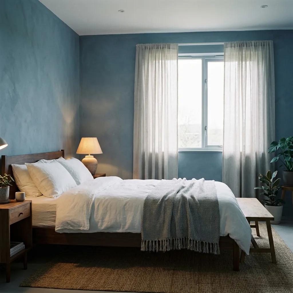
- Creates a calm, restful atmosphere ideal for sleep
- Pairs naturally with white, gray, and dark wood
- Feels sophisticated without being overly dramatic
- Suits bedrooms designed purely around relaxation
Slate blue carries a quiet, restful quality that makes it especially well suited to bedrooms designed for winding down at the end of the day. Unlike brighter blues, slate has a muted gray undertone that keeps it grounded rather than energetic, which is exactly the mood most people want in a sleeping space. In my experience, this shade performs beautifully in bedrooms with dark wood furniture, since the two tones share a similar coolness that feels cohesive rather than competing. Slate blue also tends to look slightly different depending on the light, shifting from soft gray in daylight to deeper blue come evening.
Styling a slate blue retreat is straightforward, since the color behaves almost like a sophisticated neutral once introduced. White bedding keeps the room feeling fresh, while gray and charcoal accents deepen the calming effect without adding visual clutter. This palette suits primary bedrooms especially well, where the priority is genuine rest rather than bold visual statements. Because slate blue avoids feeling trendy, it also tends to age gracefully over time. For a bedroom meant to feel like a true retreat from a busy day, slate blue remains a quietly excellent choice.
18. Warm Caramel Tones
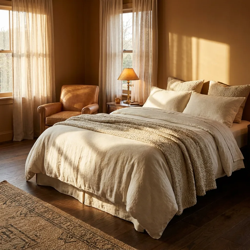
- Brings a rich, honeyed warmth into the bedroom
- Pairs naturally with cream, brass, and dark wood
- Feels cozy without becoming visually heavy
- Suits bedrooms wanting a warm autumnal feel year-round
Caramel tones bring a honeyed richness to a bedroom that feels instantly cozy without tipping into the heaviness of darker browns. This shade has a natural warmth that seems to glow under lamp light, making evenings in the bedroom feel especially inviting. I’ve noticed this palette works particularly well in bedrooms with leather or suede furniture, since the materials echo the same warm, rich tone found in the walls. Caramel also pairs beautifully with cream and ivory bedding, creating a soft contrast that keeps the overall room from feeling too dark despite the depth of the wall color itself.
This palette suits people drawn to warm, autumnal color stories that feel comforting regardless of the season outside. Brass and gold hardware enhance caramel’s natural warmth, while dark wood flooring grounds the space and prevents it from feeling too soft or washed out. Textured throws and woven baskets add dimension without introducing competing colors. For anyone wanting a bedroom that feels like a warm hug at the end of a long day, caramel tones offer a rich, inviting, and genuinely comforting option that rarely goes out of style.
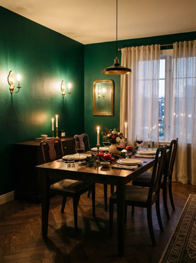
you may also like: Moody Dining Room Ideas
19. Sage And Cream
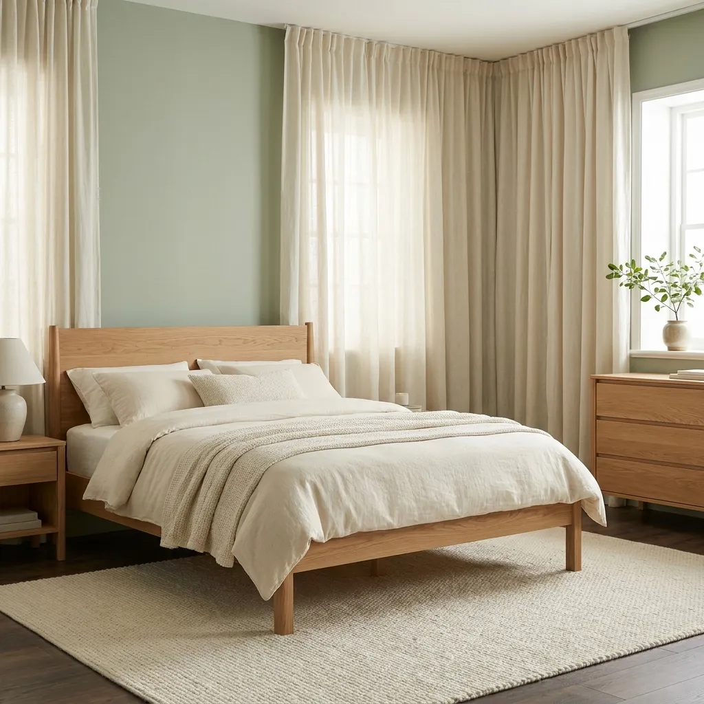
- Combines two calming neutrals into one soft palette
- Feels fresh, clean, and effortlessly put together
- Suits nurseries, guest rooms, and primary bedrooms alike
- Rarely requires bold accent colors to feel complete
Pairing sage green with cream creates one of the most universally soothing bedroom color schemes available, combining two naturally calming tones into a single cohesive palette. Neither color competes for attention, which allows the room to feel effortlessly put together without requiring bold accent pieces or statement furniture. That’s why many designers recommend this combination for nurseries and guest rooms, where a gentle, welcoming atmosphere matters more than a strong style statement. The softness of cream keeps sage from feeling too cool, while sage adds just enough color to prevent the room from feeling plain or overly neutral.
This palette is remarkably easy to style, since both colors act almost like neutrals on their own. Natural wood furniture bridges the two tones beautifully, while woven textures like jute and linen reinforce the calm, organic feeling of the room. Because sage and cream avoid strong contrast, mistakes in styling are difficult to make, which is reassuring for anyone newer to decorating. This combination also transitions smoothly across seasons, feeling fresh in spring and equally cozy in winter. For a bedroom meant to feel gentle, clean, and quietly restful, sage and cream rarely disappoints.
20. Burnt Orange Accents
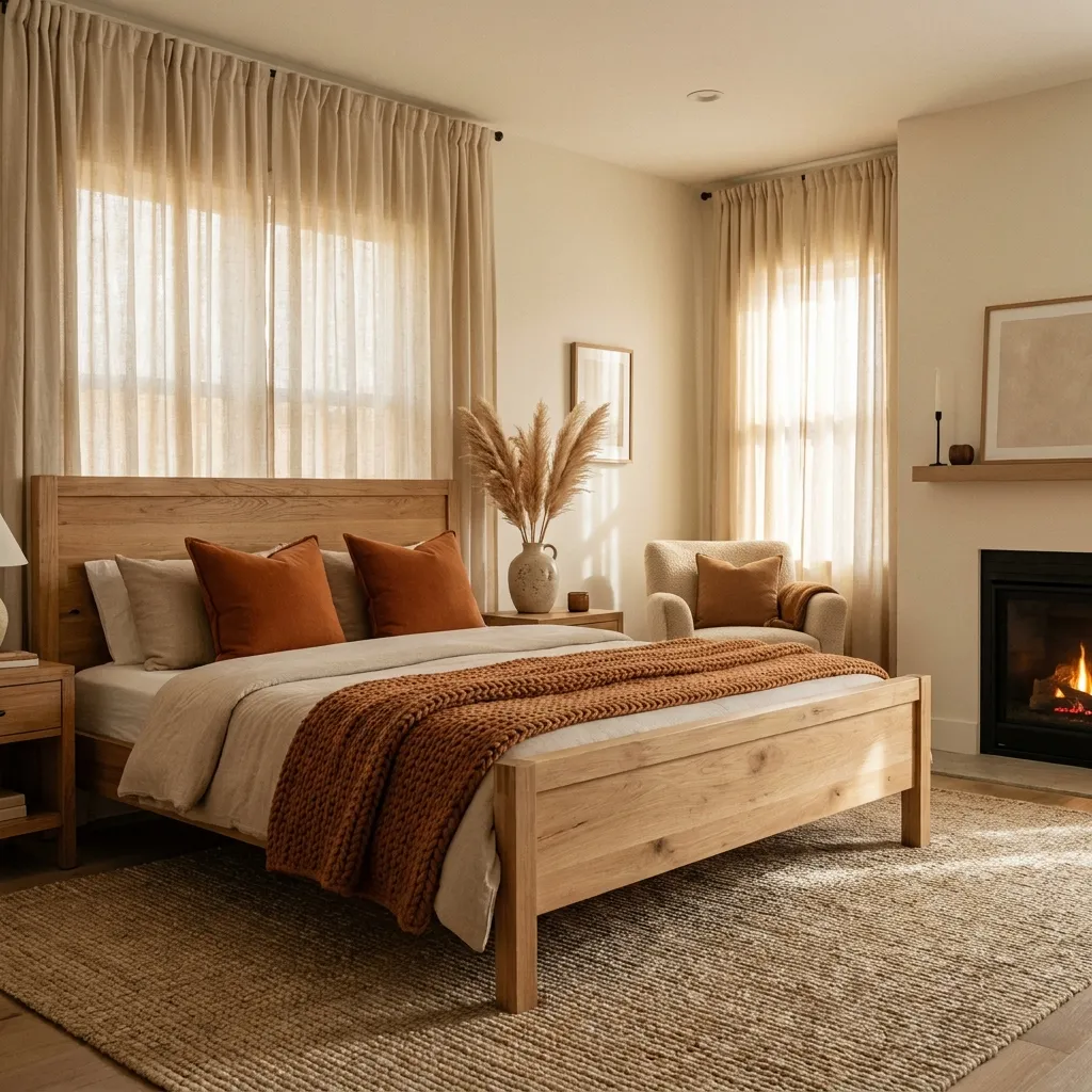
- Adds bold warmth without requiring a full repaint
- Pairs beautifully with cream, tan, and dark wood
- Suits bedrooms wanting a cozy autumnal touch
- Easy to introduce through textiles and small accents
Burnt orange offers a bold way to add warmth to a bedroom without committing to a full wall repaint, making it an especially approachable choice through pillows, throws, and small decorative accents. This deeper, muted orange feels autumnal and grounded rather than bright or overwhelming, which keeps it from clashing with an otherwise neutral room. I’ve tried introducing this shade through textiles alone in several rooms, and it consistently adds just enough personality to make a space feel warmer and more finished. Against cream or white walls, burnt orange reads as a confident accent rather than an overpowering statement color.
Because burnt orange is introduced through smaller elements, it’s an ideal option for renters or anyone hesitant to commit to bold paint choices. Cream, tan, and dark wood tones all provide a neutral backdrop that lets the orange stand out without fighting for attention. Seasonal swapping is also simple, since pillow covers and throws can be changed easily as preferences shift over time. For a bedroom that wants a touch of cozy, autumnal warmth without a major renovation, burnt orange accents deliver noticeable impact for very little effort or expense.
21. Soft Gray Neutrals
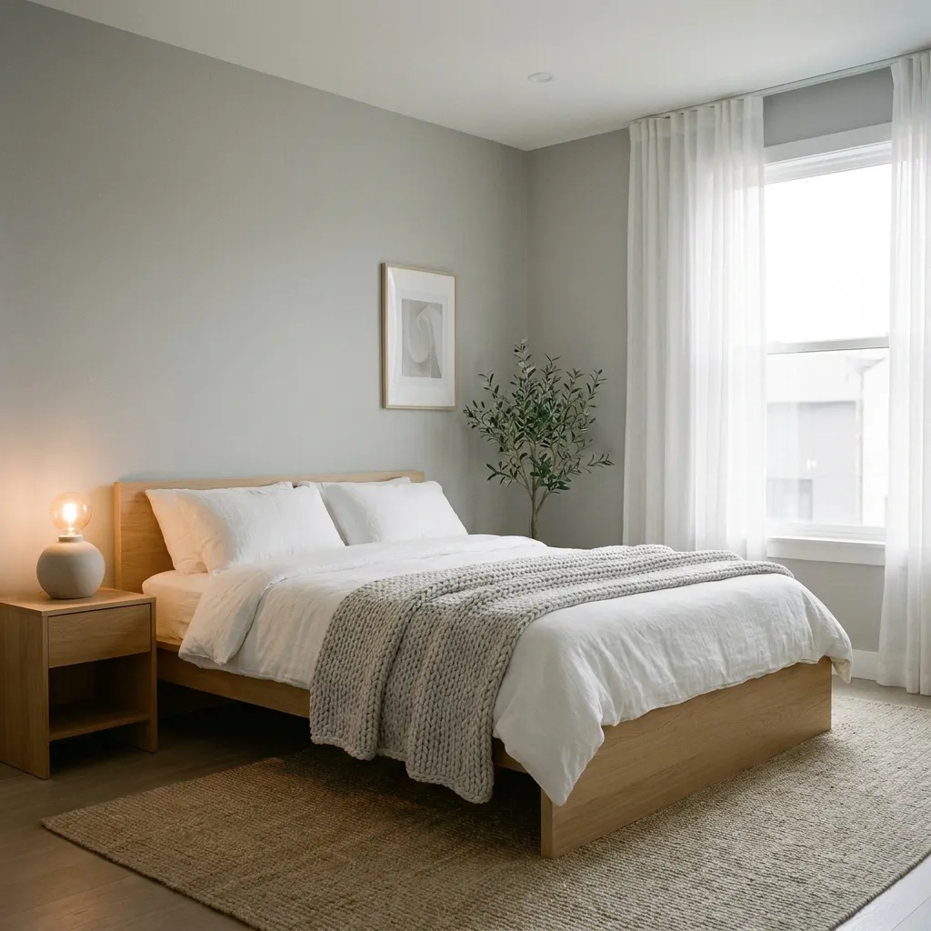
- Creates a clean, calm backdrop for any bedroom style
- Works well with both warm and cool accent colors
- Feels timeless without becoming visually plain or boring
- Suits minimalist, modern, and traditional bedrooms alike
Soft gray remains one of the most dependable neutrals for a bedroom, offering a clean, calm backdrop that works with virtually any accent color or furniture style. Unlike stark white, gray carries just enough depth to feel intentional rather than blank, especially when a warmer gray undertone is chosen instead of a cooler one. In my experience, this shade suits homeowners who want flexibility above all else, since gray adapts easily to changing decor over time without ever needing to be repainted. It also photographs well in almost any lighting, which makes it a popular backdrop for styled, shareable bedroom spaces.
Among the many bedroom color schemes built around neutral bases, soft gray stands out for how effortlessly it supports change. Warm wood furniture softens its coolness, while brass or gold accents add richness without clashing. For those who prefer a cooler palette, silver and black hardware pair just as naturally. Because gray behaves as a true neutral, seasonal styling through bedding, art, and textiles becomes simple and low-risk. For anyone wanting a bedroom that feels calm, modern, and endlessly adaptable, soft gray neutrals remain a genuinely reliable long-term foundation.
This post rounds up 21 bedroom color scheme ideas for creating a cozy, stylish retreat — from warm terracotta and soft sage to moody charcoal and navy-and-gold. Each idea includes styling tips, real-world insight into why the palette works, and a visual description to help readers picture (or recreate) the look in their own space. It’s designed to help readers move beyond plain white or gray walls and find a palette that actually feels warm, personal, and restful.
One Comment